flowchart TB
  R1["<b>1 · Seeing</b><br/>what promoted users spend<br/><i>the dashboard: +$10.35</i>"]
  R2["<b>2 · Doing</b><br/>what happens if we send the coupon<br/><i>the budget-renewal decision</i>"]
  R3["<b>3 · Imagining</b><br/>what this user would have done untreated<br/><i>who to target, and who to spare</i>"]
  R1 -->|"needs a causal assumption"| R2
  R2 -->|"needs a model per user"| R3
1 Causal inference
Causal inference estimates what would happen under an intervention, as opposed to observing associations. The estimand is typically a contrast between potential outcomes — spend with vs without treatment — of which only one is observed per unit.
This post covers:
- Developmental precursors (perception, covariation, intervention, counterfactuals).
- Pearl’s DAGs and Rubin’s potential outcomes on two product-analytics examples.
- Uplift modelling for heterogeneous effects.
All figures use simulated data with known true effects, because counterfactual outcomes are unobservable in real datasets.
2 Developmental precursors
Children assemble causal reasoning before formal instruction:
- Perception: Michotte (1946) — contact + timing → perceived launch; delay collapses impression.
- Covariation: Gopnik blicket-detector studies — preschoolers track block–light co-occurrence; screen off spurious associations.
- Intervention: manipulate one block at a time; play as experimental design.
- Counterfactuals: by age 3–4 — blame, regret, mechanism-seeking.
Formal science makes the same toolkit explicit and auditable.
3 Time and causation
Hume: constant conjunction + temporal priority + contiguity. Modern accounts (Pearl structural equations; Woodward interventionism) define causation as dependence under manipulation; temporal order is not definitional.
Simultaneous causes exist (book on table → deformation). Time order remains useful for identifying pre-treatment covariates safe to adjust for.
4 Product analytics setup
Synthetic simulation standing in for subscription-app telemetry: event log joined to billing, one row per user per month. Generating process uses one confounder and 8,000–20,000 rows.
Fictional company: ~2M monthly actives, ~$30 spend/user/month. Two dashboard numbers drive planning decisions.
4.1 Promotion example
- 400,000 users received $5-off coupon (Nov–Dec); auto-applied at checkout.
- Break-even: coupon must add >$5 incremental monthly spend per recipient.
- Dashboard: promoted users spend +$10.35/month more.
4.2 Feature example
- “Collections” shipped to all users; ~50% adoption.
- Dashboard: adopters spend +$9.26/month more.
- Decisions: engineering priority, onboarding slot, team credit.
Both SQL numbers are correct. Neither equals the causal estimand without adjustment.
5 Pearl and Rubin frameworks
| Framework | Role |
|---|---|
| Pearl (DAGs) | Declare structure; identify adjustment sets; verdict on recoverability |
| Rubin (potential outcomes) | Estimate effect given identified adjustment set; attach SE |
| Uplift modelling | Heterogeneous per-user effects |
5.1 Ladder of causation
Rung 1: observational comparisons. Rung 2: intervention effects. Rung 3: individual counterfactuals. No amount of rung-1 data identifies rung-2 quantities without assumptions.
6 Promotion: confounding by holiday
Marketing targeted coupons during holiday window when spend rises anyway. Structure: promo ← holiday → spend.
Confounder
A variable causing both treatment and outcome, inducing association without a direct causal arrow between treatment and outcome.
flowchart LR
  subgraph OBS["What marketing ran"]
    direction TB
    H1["🎄 holiday window"] -->|"targeting rule"| P1["promo sent"]
    H1 -->|"people spend more<br/>anyway (the backdoor)"| S1["monthly spend"]
    P1 -->|"the effect we want"| S1
  end

  subgraph DOG["do(promo): a coin decides"]
    direction TB
    C2(("coin")) --> P2["promo sent"]
    H2["🎄 holiday window"] --> S2["monthly spend"]
    P2 -->|"the effect we want"| S2
  end

  %% Invisible link, purely to pin the observed graph left of the surgery.
  OBS ~~~ DOG
Intervention do(promo) cuts all arrows into promo; assignment replaced by experimenter.
6.1 Pearl: randomised vs targeted assignment
True lift: $4/month. Same population drawn once; marketing targets vs coin flip.
Code
import networkx as nx
import numpy as np

rng = np.random.default_rng(7)
n = 20_000
TRUE_LIFT = 4.0  # dollars of monthly spend a promo really causes
COUPON_COST = 5.0  # dollars of margin the coupon gives away each month

# The assumed structure: the holiday window drives targeting *and* spending.
g = nx.DiGraph([("holiday", "promo"), ("holiday", "spend"), ("promo", "spend")])
print("parents of spend:", sorted(g.predecessors("spend")))


# One population, drawn once: the same users, the same holidays, the same luck.
holiday = rng.binomial(1, 0.3, n)  # 30% of users are in a holiday window
luck = rng.normal(0, 5, n)


def assign(marketing_targets: bool):
    # Intervening severs holiday -> promo: a coin decides, so targeting can't bias it.
    p = 0.2 + 0.6 * holiday if marketing_targets else np.full(n, 0.5)
    return rng.binomial(1, p)


def spend_under(promo):
    return 30 + 12 * holiday + TRUE_LIFT * promo + luck


def gap(promo, spend):
    return round(spend[promo == 1].mean() - spend[promo == 0].mean(), 2)


promo = assign(marketing_targets=True)  # who marketing chose
promo_rct = assign(marketing_targets=False)  # who a coin would have chosen
spend, spend_rct = spend_under(promo), spend_under(promo_rct)

dashboard = gap(promo, spend)
do_estimate = gap(promo_rct, spend_rct)
print("seeing, E[spend | promo]    :", dashboard)
print("doing,  E[spend | do(promo)]:", do_estimate)
parents of spend: ['holiday', 'promo']
seeing, E[spend | promo] : 10.35
doing, E[spend | do(promo)]: 4.06- Seeing: +$10.35 (confounded).
- Doing (simulated RCT): +$4.06 ≈ true $4.
6.2 Rubin: inverse propensity weighting
Without rerun: potential outcomes \(Y(1), Y(0)\); effect = \(Y(1)-Y(0)\); only one observed.
Counterfactual
Outcome under the treatment a unit did not receive. All estimators below impute this missing column.
Conditional ignorability given holiday blocks backdoor path. Inverse propensity weighting (IPW): weight by \(1/P(\text{arm} \mid \text{holiday})\).
Code
from sklearn.linear_model import LogisticRegression

# Only the observational arm: marketing targeted, and there is no rerun.
X = holiday[:, None]
ps = LogisticRegression().fit(X, promo).predict_proba(X)[:, 1]

# Weight each user by 1 / P(the arm they landed in), rebuilding a population in
# which the holiday no longer predicts who was sent a coupon.
w = np.where(promo == 1, 1 / ps, 1 / (1 - ps))
ipw_promo = round(
    np.average(spend[promo == 1], weights=w[promo == 1])
    - np.average(spend[promo == 0], weights=w[promo == 0]),
    2,
)
print("dashboard gap      :", dashboard)
print("propensity-weighted:", ipw_promo)
dashboard gap : 10.35
propensity-weighted: 3.88IPW: +$3.88 from same observational rows.
6.3 Decision boundary
Break-even: $5 coupon cost.
flowchart LR
  D["one dataset<br/>400k coupons<br/>sent in Nov–Dec"]
  D --> N["read it raw<br/><b>+$10.35</b>"]
  D --> A["adjust for<br/>the holiday<br/><b>+$3.88</b>"]
  N --> N2["clears the $5<br/>coupon cost<br/>→ renew the $2M budget"]
  A --> A2["misses the $5<br/>coupon cost<br/>→ stop, or retarget off-season"]
  N2 --> N3["≈ −$1 per user<br/>per month, booked<br/>as the quarter's win"]
  A2 --> A3["$2M freed, and the<br/>holiday cohort stops<br/>being double-counted"]
Code
import matplotlib.pyplot as plt

PURPLE, PURPLE_MID, PURPLE_LIGHT = "#4A3AA7", "#6A5CBB", "#B7AEE4"
ACCENT, INK, MUTED, GRID = "#C2570A", "#1F1D24", "#6B6673", "#DCDAE2"


def estimate_chart(labels, values, truth, truth_label, line, line_label, region_label):
    """Estimates as bars, with the truth and the decision boundary as rules."""
    fig, ax = plt.subplots(figsize=(7.6, 2.9))
    y = np.arange(len(labels))[::-1]
    colours = [PURPLE_LIGHT] + [PURPLE_MID] * (len(labels) - 1)
    ax.barh(y, values, height=0.55, color=colours, zorder=3)
    for yi, v in zip(y, values):
        # White backing so a value label never reads as crossed out by the decision rule.
        ax.text(v + 0.12, yi, f"${v:.2f}", va="center", color=INK, fontsize=10, zorder=7,
                bbox=dict(facecolor="white", edgecolor="none", pad=1.2))

    top = max(values + [line, truth]) * 1.28
    ax.axvspan(line, top, color=ACCENT, alpha=0.06, zorder=0)
    ax.axvline(truth, color=INK, lw=1.4, zorder=2)
    ax.axvline(line, color=ACCENT, lw=1.4, ls="--", zorder=2)
    ax.text(truth, len(labels) - 0.35, f"  {truth_label}", color=INK, fontsize=9)
    ax.text(line, -0.95, f" {line_label}", color=ACCENT, fontsize=9, va="center")
    ax.text(top, -0.95, f"{region_label} ", color=ACCENT, fontsize=9,
            va="center", ha="right", style="italic")

    ax.set_yticks(y, labels, fontsize=10, color=INK)
    ax.set_xlim(0, top)
    ax.set_ylim(-1.4, len(labels) - 0.1)
    ax.set_xlabel("incremental monthly spend per user ($)", color=MUTED, fontsize=9)
    ax.xaxis.grid(True, color=GRID, lw=0.7, zorder=1)
    ax.tick_params(colors=MUTED, labelsize=9)
    ax.tick_params(axis="y", colors=INK)
    for side in ("top", "right", "left"):
        ax.spines[side].set_visible(False)
    ax.spines["bottom"].set_color(GRID)
    fig.tight_layout()
    return fig


estimate_chart(
    ["Dashboard\n(promoted vs not)", "Rubin\n(propensity-weighted)", "Randomised rerun\n(unavailable in practice)"],
    [dashboard, ipw_promo, do_estimate],
    truth=TRUE_LIFT,
    truth_label=f"true lift ${TRUE_LIFT:.2f}",
    line=COUPON_COST,
    line_label=f"${COUPON_COST:.0f} coupon cost — break-even",
    region_label="renew territory",
)
plt.show()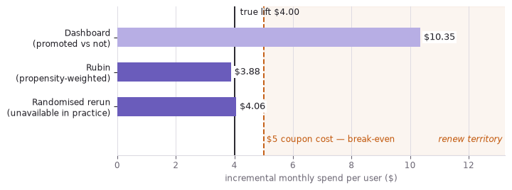
Only unadjusted dashboard clears $5 break-even. Adjusted estimate implies ~$1/user/month loss → stop or retarget off-season.
7 Feature: self-selection confounding
Collections shipped to all; users self-select. Pre-launch engagement (sessions/week) causes both adoption and spend.
flowchart LR
  E["pre-launch engagement<br/><i>sessions per week</i>"] -->|"heavy users<br/>adopt first"| A["adopted Collections"]
  E -->|"heavy users<br/>spend more"| S["monthly spend"]
  A -->|"the effect we want"| S
Backdoor path: adopted ← engagement → spend. Conditioning on {engagement} suffices.
7.1 Pearl: g-computation
True lift: $2.50/month.
Code
from sklearn.linear_model import LinearRegression

rng = np.random.default_rng(0)
n = 8_000
engagement = rng.normal(size=n)  # measured confounder: sessions/week before launch

# Both potential outcomes, written down for everyone. Reality reveals one.
y0 = 30 + 8 * engagement + rng.normal(0, 4, n)  # monthly spend if they never adopt
y1 = y0 + 2.50  # spend if they adopt: true average lift = $2.50

# Nobody assigned this: heavy users found the feature on their own.
adopted = rng.binomial(1, 1 / (1 + np.exp(-engagement)))
spend = np.where(adopted == 1, y1, y0)  # the other column is now missing
naive_feature = round(spend[adopted == 1].mean() - spend[adopted == 0].mean(), 2)
print("dashboard adopter gap:", naive_feature)

# The adjustment formula: model spend given adoption *and* engagement, then average
# the model over everyone twice -- once forcing adoption on, once forcing it off.
outcome = LinearRegression().fit(np.column_stack([adopted, engagement]), spend)


def population_mean(arm):
    return outcome.predict(np.column_stack([np.full(n, arm), engagement])).mean()


gcomp = round(population_mean(1) - population_mean(0), 2)
print("adjustment formula   :", gcomp)
dashboard adopter gap: 9.26
adjustment formula : 2.44- Dashboard: +$9.26.
- G-computation: +$2.44 (true $2.50).
7.2 Rubin: IPW on feature
Code
X = engagement[:, None]
ps = LogisticRegression().fit(X, adopted).predict_proba(X)[:, 1]
w = np.where(adopted == 1, 1 / ps, 1 / (1 - ps))
ipw_feature = round(
    np.average(spend[adopted == 1], weights=w[adopted == 1])
    - np.average(spend[adopted == 0], weights=w[adopted == 0]),
    2,
)
print("propensity-weighted:", ipw_feature)
propensity-weighted: 2.45IPW: +$2.45.
7.3 Priority ranking
Competing initiative: checkout redesign, +$3.10 from randomised A/B test.
Code
NEXT_BEST = 3.10  # checkout redesign, measured in a clean A/B test

estimate_chart(
    ["Dashboard\n(adopters vs not)", "Pearl\n(adjustment formula)", "Rubin\n(propensity-weighted)"],
    [naive_feature, gcomp, ipw_feature],
    truth=2.50,
    truth_label="true lift $2.50",
    line=NEXT_BEST,
    line_label=f"${NEXT_BEST:.2f} — randomised checkout redesign",
    region_label="Collections goes first",
)
plt.show()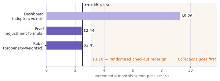
At $9.26, Collections wins both engineering and onboarding slots. At $2.45, checkout redesign takes priority.
8 Unmeasured confounding
Suppose unlogged life changes (new job, baby, move) affect both adoption and spend.
flowchart LR
  E["pre-launch engagement<br/><i>logged</i>"] --> A["adopted Collections"]
  E --> S["monthly spend"]
  A -->|"the effect we want"| S
  U["life change<br/><i>never logged</i>"] -.->|"open backdoor"| A
  U -.-> S
  style U fill:#FDF1E7,stroke:#C2570A,stroke-dasharray:4 3
Pearl verdict: not identified. Estimators run anyway:
Code
rng = np.random.default_rng(11)
n = 8_000
engagement = rng.normal(size=n)
life_change = rng.binomial(1, 0.25, n)  # new job, new baby, new city -- never logged

y0 = 30 + 8 * engagement + 9 * life_change + rng.normal(0, 4, n)
y1 = y0 + 2.50  # the true lift has not changed
adopted = rng.binomial(1, 1 / (1 + np.exp(-(engagement + 1.6 * life_change))))
spend = np.where(adopted == 1, y1, y0)

# Adjust for everything that was logged, which is engagement and nothing else.
X = engagement[:, None]
ps = LogisticRegression().fit(X, adopted).predict_proba(X)[:, 1]
w = np.where(adopted == 1, 1 / ps, 1 / (1 - ps))
ipw_u = np.average(spend[adopted == 1], weights=w[adopted == 1]) - np.average(
    spend[adopted == 0], weights=w[adopted == 0]
)
mu = LinearRegression().fit(np.column_stack([adopted, engagement]), spend)
g_u = mu.predict(np.column_stack([np.ones(n), engagement])).mean() - mu.predict(
    np.column_stack([np.zeros(n), engagement])
).mean()

print("dashboard adopter gap:", round(spend[adopted == 1].mean() - spend[adopted == 0].mean(), 2))
print("propensity-weighted  :", round(ipw_u, 2))
print("adjustment formula   :", round(g_u, 2))
print("true lift            : 2.5")
dashboard adopter gap: 10.71
propensity-weighted : 4.8
adjustment formula : 4.8
true lift : 2.5Both estimators return ~$4.80 (true $2.50). Agreement indicates shared bias, not validity. Sensitivity tools (Rosenbaum bounds, E-value) quantify required hidden confounding. Two methods agreeing confirms arithmetic, not assumptions.
9 Uplift modelling
Average treatment effect can mask heterogeneity. Feature helps newcomers (+$0.60 at tenure 0), hurts veterans (−$0.60 at tenure 1); average ≈ $0.
Code
from sklearn.ensemble import RandomForestRegressor

rng = np.random.default_rng(42)
n = 8_000
tenure = rng.uniform(0, 1, n)  # 0 = brand new user, 1 = long-time power user
variant = rng.binomial(1, 0.5, n)  # a clean 50/50 split: no confounding at all

# The feature helps newcomers and annoys veterans; averaged over users it cancels.
effect = 0.60 - 1.20 * tenure
spend = 30 + 16 * tenure + variant * effect + rng.normal(0, 1.2, n)
measured = round(spend[variant == 1].mean() - spend[variant == 0].mean(), 2)
print("measured average effect :", measured)


# One model per arm. Their gap at the same user is that user's predicted effect.
def fit(arm):
    X = tenure[variant == arm][:, None]
    return RandomForestRegressor(min_samples_leaf=50, random_state=0).fit(
        X, spend[variant == arm]
    )


ite = fit(1).predict(tenure[:, None]) - fit(0).predict(tenure[:, None])
print("newest quartile         :", round(ite[tenure < 0.25].mean(), 2))
print("longest-tenured quartile:", round(ite[tenure > 0.75].mean(), 2))
print("share with positive lift:", round((ite > 0).mean(), 2))
measured average effect : 0.01
newest quartile : 0.56
longest-tenured quartile: -0.49
share with positive lift: 0.49- A/B average: +$0.01 (describes no user).
- Newest quartile ITE: +$0.56 (true +$0.45).
- Longest-tenured: −$0.49 (true −$0.45).
Code
order = np.argsort(tenure)
t_sorted, ite_sorted = tenure[order], ite[order]
crossing = 0.60 / 1.20  # tenure at which the true effect changes sign
lo, hi = ite[tenure < 0.25].mean(), ite[tenure > 0.75].mean()
label_box = dict(facecolor="white", edgecolor="none", alpha=0.85, pad=1.8)

fig, ax = plt.subplots(figsize=(7.6, 3.8))
ax.axvspan(0, crossing, color=PURPLE, alpha=0.06, zorder=0)
ax.axvline(crossing, color=MUTED, lw=1.0, ls=(0, (4, 3)), zorder=2)

ax.plot(t_sorted, ite_sorted, color=PURPLE, lw=1.1, alpha=0.55, zorder=3,
        label="predicted per-user effect")
ax.plot(t_sorted, 0.60 - 1.20 * t_sorted, color=INK, lw=1.5, ls=(0, (5, 3)), zorder=4,
        label="true effect")
ax.axhline(measured, color=ACCENT, lw=1.8, ls=":", zorder=5,
           label=f"what the A/B test reported: ${measured:+.2f}")

# The two quartile averages, drawn where they actually apply.
ax.hlines(lo, 0, 0.25, color=ACCENT, lw=3, zorder=6)
ax.hlines(hi, 0.75, 1, color=ACCENT, lw=3, zorder=6)
ax.text(0.125, lo + 0.16, f"newest quartile  ${lo:+.2f}", color=ACCENT, fontsize=9,
        ha="center", zorder=7, bbox=label_box)
ax.text(0.875, hi - 0.24, f"longest-tenured  ${hi:+.2f}", color=ACCENT, fontsize=9,
        ha="center", zorder=7, bbox=label_box)
ax.text(crossing - 0.02, ite_sorted.min() * 1.05, "ship to this side ", color=MUTED,
        fontsize=9, ha="right", style="italic", zorder=7)

ax.set_xlabel("tenure  (0 = brand new, 1 = long-time power user)", color=MUTED, fontsize=9)
ax.set_ylabel("effect on monthly spend ($)", color=MUTED, fontsize=9)
ax.set_xlim(0, 1)
ax.yaxis.grid(True, color=GRID, lw=0.7, zorder=1)
ax.tick_params(colors=MUTED, labelsize=9)
for side in ("top", "right"):
    ax.spines[side].set_visible(False)
for side in ("bottom", "left"):
    ax.spines[side].set_color(GRID)
ax.legend(frameon=False, fontsize=9, loc="upper right", labelcolor=INK)
fig.tight_layout()
plt.show()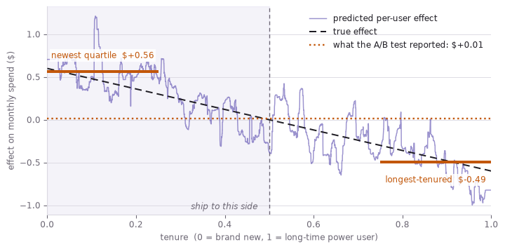
Target users with predicted ITE > 0 (~50% of userbase).
9.1 Winner’s curse in uplift totals
Summing predicted ITEs for selected users overstates delivered effect (selection on noisy estimates).
Code
AUDIENCE = 2_000_000  # monthly actives
ship = ite > 0


def monthly(mask, per_user):
    return AUDIENCE * per_user[mask].sum() / n


print("promised by the model :", round(monthly(ship, ite)))  # sums the estimates
print("actually delivered    :", round(monthly(ship, effect)))  # sums the true effects
print("best possible gate    :", round(monthly(effect > 0, effect)))
print("ship to everyone      :", round(monthly(np.ones(n, bool), effect)))
promised by the model : 393990
actually delivered : 272321
best possible gate : 304602
ship to everyone : 10025- Promised: ~$394k/month.
- Delivered: ~$272k/month.
- Perfect-knowledge gate: ~$304k/month.
- Ship-to-everyone: ~$0 (by construction).
Gap ($394k vs $272k) is winner’s curse, not estimator bug. Gate maintenance cost (two product experiences) is outside the model.
10 Estimator summary
All methods estimate counterfactual outcomes. Claims differ:
| Method | Randomisation claim |
|---|---|
| RCT | Unconditional (experimenter owns assignment) |
| IPW, g-computation | Conditional on recorded covariates |
| DAG | Structural (which arrows absent) |
Pearl: make assumptions writable and refusable (“not identified”). Rubin: licensed assumption → estimate + SE. Uplift: platform acts on individual effects, not averages — with recursive optimism when totals use estimates that selected the audience.
Assumptions. Must. Be. Writable. Do. Is. Not. See. Identification. First.
11 References
- Michotte, A. — The Perception of Causality (1946): the launching effect, and causality as something seen rather than inferred.
- Gopnik, A. and colleagues — blicket detector studies on causal learning and intervention in preschoolers.
- Hume, D. — A Treatise of Human Nature (1739): constant conjunction, contiguity, temporal priority.
- Pearl, J. — Causality (2000) and The Book of Why (2018): DAGs, the
dooperator, the backdoor criterion, the ladder of causation. - Neyman, J. and Rubin, D. — the potential outcomes framework; Rosenbaum and Rubin
- on propensity scores.
- Hernán, M. and Robins, J. — Causal Inference: What If (2020): the standard modern treatment of the adjustment formula and g-computation, after Robins (1986).
- VanderWeele, T. and Ding, P. — “Sensitivity Analysis in Observational Research: Introducing the E-Value” (2017): how much unmeasured confounding would be needed.
- Künzel, S. and colleagues — “Metalearners for estimating heterogeneous treatment effects” (2019): the one-model-per-arm construction used above.
- Woodward, J. — Making Things Happen (2003): the interventionist account of causal explanation.
- Chernozhukov, V. and colleagues — “Double/Debiased Machine Learning” (2018): using ML nuisance models without importing their bias.