Explainability Is a Localization Problem

Saliency maps on MNIST, confidence intervals on Iris — every explanation answers the same question, which parts?. They differ in what counts as a part, what counts as responsible, and whether the answer comes with error bars.

Four attribution methods on a misclassified MNIST digit and four classical decompositions of Fisher’s irises, implemented from scratch and checked at build time — set against one framing that covers all eight.
Machine Learning
Statistics
Explainability
Python
Author

Ravi Kalia

Published

July 31, 2026

Explainability Is a Localization Problem

A model says “six”. Which parts of the image made it say that?

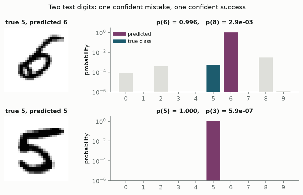
Here is test digit number 9729 of MNIST. A convolutional network that gets 98.8% of the test set right looks at it and returns 6 with probability 0.996. The digit is a 5. The network’s probability for the correct answer is 0.00055 — third place, behind not only the 6 but an 8.

Something in those 784 pixels made the network confident. The question “why?” is unhelpfully broad, but there is a sharper version of it that we can actually answer: which parts of the input were responsible for the output, and how much? That is a localization problem. It has a shape — you name a set of parts, you define a way of assigning credit to each, and you get back a number per part.

Almost every explainability method in use is an answer to that problem, and the differences between them come down to three choices:

  1. What counts as a part? A pixel. A patch. An internal channel of a convolution. A column of a table. A direction in feature space.
  2. What counts as responsible? A local gradient. The damage done by deleting it. An attribution satisfying stated axioms. A share of variance. The effect of an intervention.
  3. Does the answer come with error bars? Almost never in machine learning. Almost always in statistics.

This post fills in all three axes with running code — four methods on a misclassified MNIST digit, four on Fisher’s irises — and then argues that the third axis is the one that still separates the two traditions.

Nothing here is typed in from a previous run. The prose interpolates values from the same objects the figures are drawn from, and 14 cross-checks run while the page builds — the completeness axiom for integrated gradients, the equivalence of two Grad-CAM implementations, hand-derived logistic standard errors against statsmodels, hand-computed ANOVA against scipy, PCA against scikit-learn. If any of them fails, the page does not render.

  • [wrong] integrated gradients sum to f(x) - f(0) within 3.7e-04 relative
  • [wrong] Grad-CAM via hooks is bit-identical to Grad-CAM via the head split
  • [wrong] Grad-CAM equals CAM / 49 to 8.9e-08 absolute
  • [wrong] all 617 baseline-valued pixels receive exactly zero from IG
  • [right] integrated gradients sum to f(x) - f(0) within 2.1e-04 relative
  • [right] Grad-CAM via hooks is bit-identical to Grad-CAM via the head split
  • [right] Grad-CAM equals CAM / 49 to 1.8e-07 absolute
  • [right] all 562 baseline-valued pixels receive exactly zero from IG
  • [wrong] the largest saliency value in the map (1.35) is on a baseline-valued pixel
  • logistic coefficients match statsmodels to 8.9e-16, standard errors to 2.7e-15
  • ANOVA F statistics match scipy.stats.f_oneway to 2.7e-15 relative
  • PCA explained-variance ratios match scikit-learn to 2.2e-16
  • setosa is linearly separable from the rest; versicolor and virginica are not
  • permutation importances agree with scikit-learn’s within Monte-Carlo error (largest gap 0.0066, largest 3-sigma bound 0.0138)

Two traditions asking one question

Statistics has been localizing responsibility for a century, and did it first because its models were small enough to make the answer legible. A regression coefficient is an attribution to a variable. Fisher’s analysis of variance, published in the 1920s, is a literal decomposition: total variability splits into a part explained by the treatment and a part left over, and the arithmetic is an identity rather than an approximation. The tradition’s characteristic move is to attach a standard error to the attribution, so that “this variable matters” can fail to be supported by the data.

Machine learning arrived at the same question from the other end. Its models are too large to read, so the parts are not chosen for interpretability — they are whatever the input happens to be made of, or whatever the architecture happens to expose. SHAP, LIME, saliency maps, Grad-CAM and integrated gradients are all attempts to recover a per-part number from a function you cannot inspect directly. They are typically point estimates with no uncertainty attached at all.

Neither tradition owns the question. They own different regimes of it, and their failures are instructive in opposite directions. Part I takes the black box; Part II takes the glass box.

Part I — Explaining a black box: MNIST

Localizing an answer means choosing parts and a credit rule. In an image the obvious part is the pixel, which is why three of the four methods below are pixel-level; the interesting one is the method that refuses, and localizes to the network’s internal channels instead.

Where these digits come from, and what a mistake costs

MNIST is a remix. The original material is two National Institute of Standards and Technology collections of handwritten characters: Special Database 3, written by Census Bureau employees, and Special Database 1, written by American high-school students. NIST gathered them to benchmark optical character recognition — the machinery that reads addresses off envelopes and amounts off cheques. The two populations do not write alike; SD-3 is markedly cleaner. Yann LeCun, Corinna Cortes and Christopher Burges rebuilt the split in the 1990s so that training and test sets each drew from both, size-normalised the glyphs into a 20×20 box and centred them by mass in a 28×28 field. That anti-aliasing is why MNIST pixels are grey rather than binary, and it matters below: a pixel can be slightly on.

The question asked of the data here is the original one — given the image, which digit is it — and the label means what a human reader took the writer to have intended. The cost of being wrong is concrete and asymmetric: a misread digit on a cheque moves money, a misread digit on an envelope moves a letter to the wrong city. Both are recoverable, which makes MNIST a fair place to study explanations. We can afford to be curious about a failure rather than alarmed by it.

Attribution methods are the right tool for exactly one reason: there are 784 inputs, they are strongly correlated with their neighbours, and no coefficient exists to read. The model is a composition of convolutions with hundreds of thousands of parameters, and the only handle on it is that it is differentiable and cheap to evaluate. Every method below exploits one of those two properties.

The model, and the two digits we keep coming back to

The classifier is a small convolutional network: two convolution blocks down to a 7×7 grid, a third convolution to 128 channels, then global average pooling and one linear layer. That last part is a deliberate choice rather than a default, and the reason appears when we get to Grad-CAM.

def features(self, x: torch.Tensor) -> torch.Tensor:
    return self.act3(self.bn3(self.conv3(self.block2(self.block1(x)))))

def head(self, a: torch.Tensor) -> torch.Tensor:
    return self.fc(a.mean(dim=(2, 3)))

Trained for four epochs on CPU under a fixed seed, it reaches 98.8% on the test set — 125 mistakes in 10,000. We will study one of them, plus a control: the digit the model gets most confidently wrong, and the digit of the same true class it gets most confidently right. Confidence is the interesting regime, because an explanation of a hesitant prediction can always be waved away as noise.

Two MNIST digits, both fives, with the model's probability over ten classes on a log scale. The first is predicted six with probability 0.996; the second is predicted five with probability 1.000.
Figure 1: The running examples. Probabilities are on a log scale, so the classes the model ranked below its answer are visible rather than flattened to the axis.

Both digits are fives. The first is written with the lower stroke curled all the way round into a closed loop, which is what a six has and a five does not. The model is not being stupid; it is being confidently wrong in a way that ought to leave a trace. Four methods now go looking for it.

Saliency: the gradient as a one-term Taylor expansion

The cheapest possible notion of responsibility is sensitivity. Expand the network’s output around this image and keep one term: the logit for class 6 changes by roughly \(\nabla_x f \cdot \delta\) under a small perturbation \(\delta\), so the gradient’s magnitude at each pixel says how fast that pixel could move the answer. Simonyan, Vedaldi and Zisserman introduced this in 2013 and it remains the floor that every other method is measured against — one backward pass, no hyperparameters.

def saliency(model: SmallCNN, x01: torch.Tensor, target: int) -> np.ndarray:
    x = _as_batch(x01).requires_grad_(True)
    model.zero_grad(set_to_none=True)
    model(normalise(x))[0, target].backward()
    return x.grad[0, 0].detach().numpy()
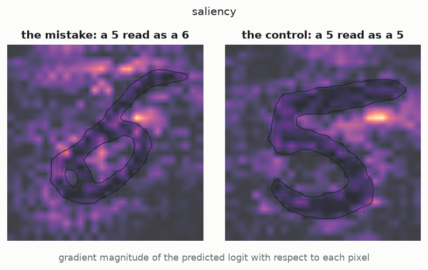
Two saliency maps over MNIST fives. Both are speckled, with bright pixels scattered inside and outside the stroke.
Figure 2: Gradient magnitude of the predicted logit. The digit’s outline is drawn on top so the attribution can be located against the stroke.

The map is speckled and only loosely attached to the digit. That is not a rendering artefact, it is what the gradient of a ReLU network looks like: a piecewise-linear function’s slope changes discontinuously across activation boundaries, so neighbouring pixels can have very different derivatives. Worse, look where the largest value lands. Of the 617 pixels in this image that are exactly black, saliency assigns a non-zero gradient to 617 of them — all of them — and the single largest gradient in the entire map, 1.35, sits on one of them.

That is a coherent statement about the model: painting ink onto that empty pixel would change the logit faster than anything else. It is not a statement about this image, which has nothing there. Sensitivity and responsibility are different questions, and saliency answers the first one.

Occlusion: responsibility as what breaks when you take it away

If the complaint about gradients is that they describe a hypothetical nudge, the fix is to make the perturbation real and finite. Slide a black square over every position in the image, re-run the network, and record how far the logit falls. A patch that was carrying the prediction leaves a hole when removed. Zeiler and Fergus used exactly this in 2013 to check that their ImageNet features were tracking objects rather than backgrounds.

def occlusion(
    model: SmallCNN,
    x01: torch.Tensor,
    target: int,
    patch: int = 7,
    fill: float = 0.0,
) -> np.ndarray:
    base = target_logit(model, x01, target)
    half = patch // 2
    img = _as_batch(x01)

    batch, centres = [], []
    for r in range(28):
        for c in range(28):
            occluded = img.clone()
            occluded[
                :, :, max(0, r - half) : r + half + 1, max(0, c - half) : c + half + 1
            ] = fill
            batch.append(occluded)
            centres.append((r, c))

    with torch.no_grad():
        logits = model(normalise(torch.cat(batch)))[:, target].numpy()

    out = np.zeros((28, 28), dtype=np.float64)
    for (r, c), value in zip(centres, logits):
        out[r, c] = base - value
    return out
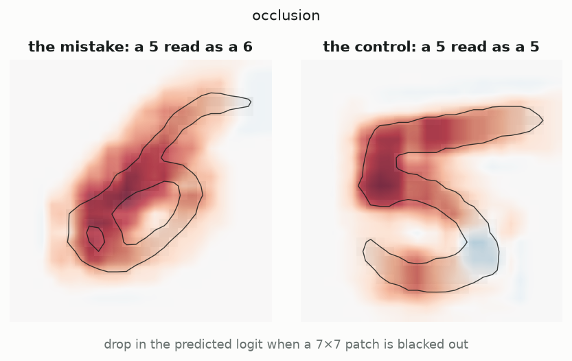
Two occlusion maps over MNIST fives. On the misclassified digit the heat concentrates on the closed lower loop.
Figure 3: Logit drop under a 7×7 black patch. Red means the patch was supporting the prediction; blue means removing it helped.

This is legible in a way saliency is not. On the misclassified digit the mass sits squarely on the closed lower loop — the feature that a six has. Cover it and the logit for 6 falls by up to 8.4. The model is not confused about pixels; it is reading a loop that is genuinely there, in a glyph whose writer intended a five.

The cost is a different blind spot. Occluding a region that is already black does nothing at all, because the occluder and the image agree. In this digit 319 pixels sit at the centre of a 7×7 patch that is entirely black, and across all of them the largest logit change occlusion can find is 4.8e-06 — floating-point noise. Saliency, over those same pixels, reports values up to 0.82. Neither method is wrong. They are answering with different definitions of absent, and where the definitions collide the answers cannot be reconciled.

Grad-CAM: localizing to channels rather than pixels

Both methods so far take the pixel as the unit of responsibility, and a pixel is a poor unit — it is far below the scale at which the network represents anything. Grad-CAM changes the parts. The units become the 128 channels of the final convolution, each of which carries a 7×7 map of where it fired. Weight each channel by the average gradient of the target logit across its map — how much turning that channel up would help — sum the channels with those weights, and keep the positive part.

def grad_cam(model: SmallCNN, x01: torch.Tensor, target: int) -> np.ndarray:
    activations = model.features(normalise(_as_batch(x01)))  # (1, 128, 7, 7)
    activations.retain_grad()
    model.zero_grad(set_to_none=True)
    model.head(activations)[0, target].backward()

    weights = activations.grad[0].mean(dim=(1, 2))  # (128,) channel weights
    cam = torch.relu((weights[:, None, None] * activations[0]).sum(0))  # (7, 7)
    return _upsample(cam.detach().numpy())
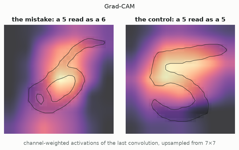
Two Grad-CAM maps over MNIST fives, each a smooth blob. On the misclassified digit the blob covers the closed loop.
Figure 4: Grad-CAM over the last convolution, upsampled from its native 7×7 grid to pixel resolution.

The map is a smooth blob, and it lands on the loop. It is also, unavoidably, coarse: the underlying grid has 49 cells for 784 pixels, so the finest distinction Grad-CAM can draw on MNIST is a 4×4 pixel block. On a 224×224 ImageNet network the same 7×7 grid buys you a 32-pixel resolution against an object that fills half the frame, which is why the method looks sharper in its original paper than it ever will here. The coarseness is intrinsic to localizing at a layer, not an artefact of the upsampling.

Two things about that channel weighting are worth stating precisely, because both are usually asserted rather than checked. First, the derivation assumes the head treats every spatial position the same way, which is true here because the head is global average pooling followed by one linear layer. On a network whose head flattens the 7×7 map instead — giving each cell its own weight — the mean gradient averages over cells that disagree, and the final ReLU can zero the map completely. That is not hypothetical: with a flatten head on this data, all 49 cells came out negative and Grad-CAM returned an empty image. The architecture was chosen to avoid it.

Second, on a network that does pool, Grad-CAM collapses onto Zhou et al.’s original CAM — the channel weights become the linear layer’s own weights, divided by the 49 cells being averaged. The build asserts it: Grad-CAM equals CAM / 49 to 8.9e-08 absolute. Grad-CAM’s contribution was never the map; it was removing the architectural precondition for computing one.

Integrated gradients: buying an axiom with a baseline

Saliency has no theory of what its numbers sum to. Occlusion has no theory at all. Integrated gradients starts from the other end: state the properties an attribution ought to have, and derive the method that satisfies them. The key property is completeness — the attributions should add up to the difference in output between this input and a chosen reference. Average the gradient along the straight path from the reference to the image, multiply by the displacement, and completeness follows from the fundamental theorem of calculus.

def integrated_gradients(
    model: SmallCNN,
    x01: torch.Tensor,
    target: int,
    baseline: torch.Tensor | None = None,
    steps: int = 512,
) -> np.ndarray:
    x = _as_batch(x01)
    base = torch.zeros_like(x) if baseline is None else _as_batch(baseline)
    # Midpoint rule: unbiased for the linear part and far more accurate than
    # left endpoints at the same cost, which matters because completeness is
    # checked numerically rather than assumed.
    alphas = (torch.arange(steps, dtype=torch.float32) + 0.5) / steps
    path = base + alphas.reshape(-1, 1, 1, 1) * (x - base)
    path.requires_grad_(True)

    model.zero_grad(set_to_none=True)
    model(normalise(path))[:, target].sum().backward()

    avg_grad = path.grad.mean(0, keepdim=True)
    return ((x - base) * avg_grad)[0, 0].detach().numpy()
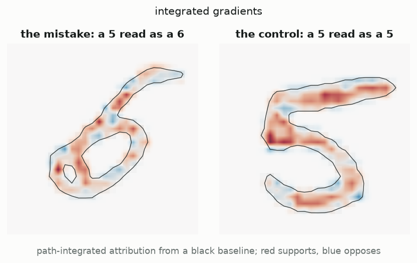
Two integrated-gradients maps over MNIST fives. Attribution is confined to the stroke; the background is uniformly blank.
Figure 5: Integrated gradients from a black baseline. Red pixels push the logit up, blue pixels push it down.

The accounting works: the attributions sum to 10.632 against a true logit difference of 10.636. And because the map is signed we get something the other three cannot express — 17.1 of positive evidence for 6 against 6.5 arguing the other way, with the blue concentrated on the top bar, the one stroke that says five.

Caveat: completeness is bought with a choice, and the choice does the work

Look at the background of that figure. It is not faint, it is exactly zero, at every one of the 617 black pixels. This is definitional, not empirical: the attribution is a displacement \(x - x'\) times an averaged gradient, and where the image equals the baseline the displacement is zero, so the product is zero whatever the network does there.

That is a real answer to saliency’s stray hotspot — integrated gradients simply cannot put mass on an empty pixel. But it is an answer by construction, and it means the baseline is not a technical parameter. It is the definition of “absent” against which everything is measured, and completeness holds relative to whatever you choose. A black baseline on MNIST encodes the assumption that blank paper is the null state, which is defensible here and much less defensible for natural images, where black is a colour that objects come in. The axiom is satisfied; the interpretation still rests on a judgement call that the axiom does not examine.

Caveat: an explanation that survives randomizing the model explains nothing

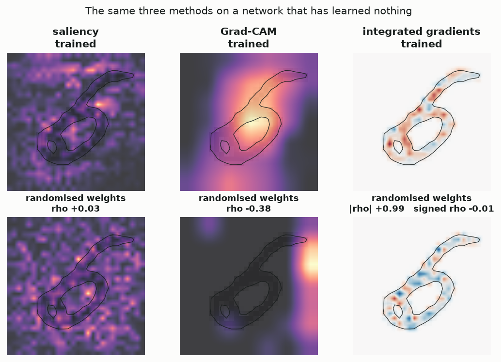
Before comparing the four maps, they should have to pass a test. Adebayo et al. proposed the sharpest one available: replace the trained weights with fresh random ones and recompute the explanation. If the picture barely changes, the method is not reading the model. It is reading the image, and the model was decorative.

A two-by-three grid. The top row shows saliency, Grad-CAM and integrated gradients from the trained network; the bottom row shows the same three from a randomly initialised network. The integrated-gradients pair look nearly identical in magnitude.
Figure 6: The same three methods applied to an untrained network on the same digit. Rank correlations are against the trained network’s map, over all 784 pixels.

Saliency and Grad-CAM pass comfortably: rank correlations of \(+0.03\) and \(-0.38\) against their trained counterparts, which is to say the untrained network’s maps carry no usable information about the trained one’s. Integrated gradients fails, and fails spectacularly — the magnitudes correlate at \(+0.99\).

The mechanism is the one from the previous caveat, seen from the other side. Every integrated-gradients attribution carries the factor \(x - x'\), which depends only on the image. That factor dominates the magnitude, so any network produces a map shaped like the digit’s stroke. The signs, which are the part carrying model information, tell a different story: their rank correlation is \(-0.01\), essentially nothing. So the honest reading is that the picture is mostly the input and the information is mostly in the colours — and a reader shown only the magnitudes would learn nothing about the model while feeling that they had.

This is worth generalising. Any attribution of the form gradient times input inherits the input’s structure, which is precisely what makes such maps look convincing. Looking like the object is not evidence that the method found the object.

What the four maps agree about, and where they part

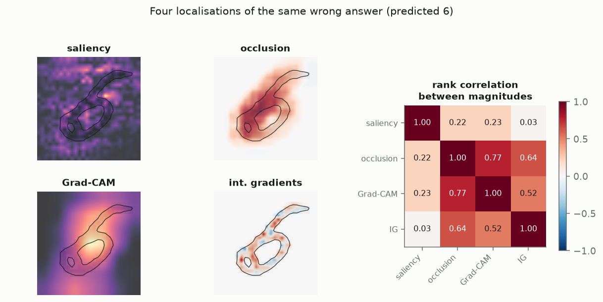
Four methods, one wrong answer. They agree more than the pictures suggest, but the disagreements are not noise — each one traces back to a definition.

Four attribution maps of a misclassified MNIST five, plus a four-by-four matrix of rank correlations. Occlusion and Grad-CAM correlate at 0.77; saliency correlates weakly with everything.
Figure 7: All four localizations of the same misclassification, with Spearman rank correlations between their magnitudes over all 784 pixels.

Occlusion and Grad-CAM correlate at \(+0.77\), and both land on the closed loop. That is the substantive finding of Part I and all four methods are consistent with it: the network read a loop, and a loop is what distinguishes a six. The two agree because they are asking similar questions at similar scale — both are coarse, both are about regions, and Grad-CAM’s blob is roughly the union of the patches that occlusion found expensive to remove.

Integrated gradients sits at \(+0.64\) with occlusion: it finds the same stroke but distributes credit along it much more finely, and spends part of its budget on the negative evidence the other two cannot represent at all.

Saliency is the outlier, correlating between \(+0.03\) and \(+0.23\) with everything else. Given the previous two sections, that is the expected result rather than a surprise. It measures a different quantity — sensitivity to a hypothetical perturbation, rather than contribution to the actual output — and it is the only one of the four that is free to put its maximum on a pixel containing nothing.

So: which parts made the network say six? Every method that defines responsibility by contribution rather than sensitivity says the same thing, which is the loop. But none of them says how sure we should be of that. Not one of the four numbers on any pixel comes with an interval, or with any way to distinguish a real effect from a fluctuation of this particular image, this particular seed, this particular training run. Part II is about a tradition that would consider that omission disqualifying.

Part II — Explaining a glass box: Iris

Same problem, opposite regime. Four features instead of 784 pixels, 150 rows instead of 60,000, and a model whose parameters are the explanation rather than an obstacle to it. What changes is not the question — still which parts, and how much — but that every answer now arrives with a statement about its own reliability.

Where these flowers come from, and what the labels mean

The measurements are Edgar Anderson’s. Working at the Missouri Botanical Garden in the 1930s on the problem of how species boundaries hold up under variation, he measured sepals and petals from irises on the Gaspé Peninsula in Quebec — four measurements per flower, in centimetres, all recorded by hand. The Iris setosa and Iris versicolor plants were, as Fisher quotes him, all from the same pasture, picked on the same day and measured at the same time by the same person with the same apparatus. The 50 Iris virginica flowers were not: they come from a different colony, and Fisher says so explicitly in the paper. The dataset is therefore two clean samples and one that was gathered under other conditions — a detail worth carrying into any claim about how well the three separate.

Ronald Fisher took that table and used it to introduce linear discriminant analysis in The Use of Multiple Measurements in Taxonomic Problems (1936). The paper appeared in the Annals of Eugenics, which Fisher edited; he was a prominent eugenicist, and that is a fact about the dataset’s history worth stating plainly rather than eliding.

The question asked of the data, then and here, is taxonomic: given four measurements, which species is this? The label is a botanist’s identification, not an instrument reading, and the downstream consequence of getting it wrong is a misclassified herbarium specimen — a research conclusion, not a diagnosis or a loan. That low stake is exactly why Iris survives as a teaching set, and it is a useful contrast with Part I: nothing below is doing work that anyone should be worried about, which leaves the statistical machinery visible.

The reason to reach for interval estimates on 150 rows is the sample size itself. Fifty flowers per species is enough to estimate a mean and nowhere near enough to treat a fitted coefficient as a fact. Two of the four measurements correlate at 0.963, which means the data cannot cleanly separate their contributions — and a method that reports uncertainty will say so, while a method that reports a point estimate will not.

Coefficients: responsibility with an error bar attached

Setosa is trivially separable from the other two, so the interesting comparison is versicolor against virginica. Fit an unpenalised logistic regression to the four standardised measurements by Newton–Raphson; at the maximum, the log-likelihood’s curvature is \(X^\top W X\) with \(W = \mathrm{diag}(p(1-p))\), and the inverse of that matrix is the asymptotic covariance of the coefficients. Sharp curvature means the data pin the coefficient down, and the standard error is small. That is the whole content of a confidence interval on a coefficient, and it is the thing Part I had no analogue of.

def fit_logistic(
    X: np.ndarray, y: np.ndarray, names: list[str], max_iter: int = 100, tol: float = 1e-10
) -> LogitFit:
    Xd = np.column_stack([np.ones(len(X)), X])
    beta = np.zeros(Xd.shape[1])
    converged, used = False, max_iter

    for step in range(max_iter):
        eta = Xd @ beta
        p = 1.0 / (1.0 + np.exp(-eta))
        W = p * (1.0 - p)
        # Ridge-free Newton step. pinv rather than solve: on separable data the
        # information matrix goes singular, and we want the run to continue and
        # report a diverging coefficient rather than raise.
        hessian = Xd.T @ (W[:, None] * Xd)
        score = Xd.T @ (y - p)
        delta = np.linalg.pinv(hessian) @ score
        beta = beta + delta
        if np.max(np.abs(delta)) < tol:
            converged, used = True, step + 1
            break

    eta = Xd @ beta
    p = np.clip(1.0 / (1.0 + np.exp(-eta)), 1e-15, 1 - 1e-15)
    W = p * (1.0 - p)
    cov = np.linalg.pinv(Xd.T @ (W[:, None] * Xd))
    loglik = float(np.sum(y * np.log(p) + (1 - y) * np.log(1 - p)))
    return LogitFit(
        beta=beta,
        se=np.sqrt(np.diag(cov)),
        cov=cov,
        iterations=used,
        converged=converged,
        loglik=loglik,
        names=["intercept"] + list(names),
    )
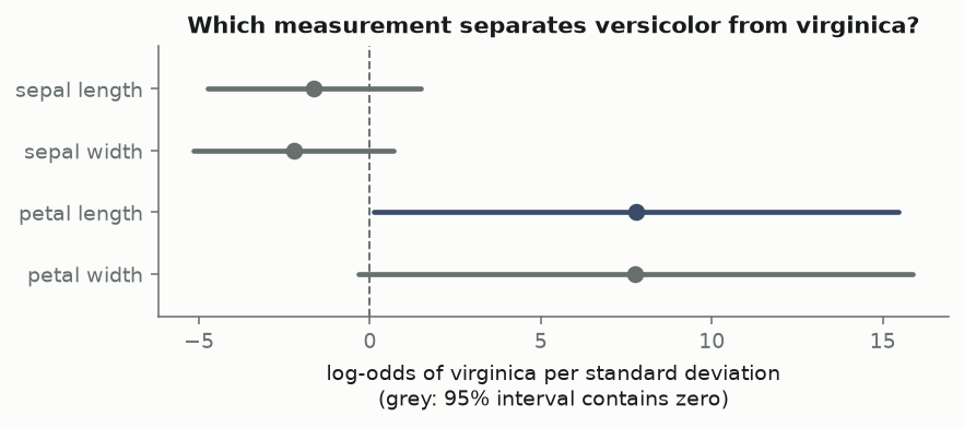
A forest plot of four logistic-regression coefficients. Petal length and petal width are large and positive with very wide intervals; both sepal coefficients straddle zero.
Figure 8: Coefficients with 95% Wald intervals, versicolor versus virginica, on standardised measurements.
term coef std err z p 2.5% 97.5%
sepal length -1.634 1.587 -1.030 0.303 -4.745 1.476
sepal width -2.223 1.491 -1.491 0.136 -5.145 0.698
petal length 7.785 3.911 1.990 0.047 0.119 15.450
petal width 7.767 4.138 1.877 0.061 -0.344 15.878

Read it as an explanation and it says: petals discriminate, sepals do not. Read it as a localization with error bars and it says something more interesting. Petal length carries a coefficient of 7.78 and petal width 7.77 — nearly identical, both enormous — and both have standard errors of roughly 4.0. Petal width’s interval crosses zero. Taken one at a time, neither petal measurement is quite significant at the 5% level.

That is not a sign that petals do not matter. It is the interval doing its job on collinear predictors: with the two petal measurements correlated at 0.963, the data can say confidently that petal size separates the species and cannot say which of the two measurements deserves the credit. The coefficients are individually unstable and jointly precise. An attribution method that returned two point estimates here would report the same split and give you no way at all to notice the problem.

Caveat: when the classes separate, there is no estimate to put an error bar on

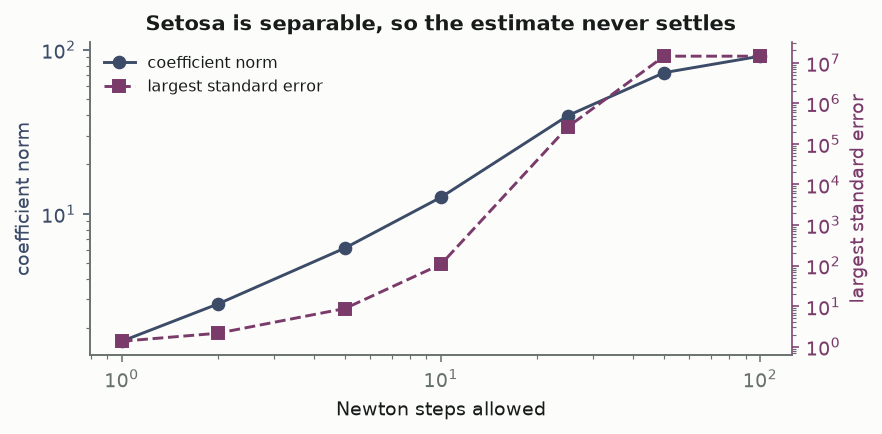
The interval only works when a maximum exists. Setosa is the standard demonstration that it need not. Ask the same unpenalised model to separate setosa from the other two species and the likelihood has no maximum: some hyperplane classifies every point correctly, so pushing the coefficients further from zero always improves the fit, and the estimate runs off to infinity. Here separation is confirmed directly, by solving the feasibility problem rather than inferring it from a fit that misbehaves.

A log-log plot. Coefficient norm rises from about 1.7 to 92 as Newton steps increase from 1 to 100; the largest standard error rises from about 1.4 to over ten million.
Figure 9: Refitting setosa-versus-rest with increasing Newton budgets. Neither the coefficients nor their standard errors converge.
newton steps coefficient norm largest std err log-likelihood
1 1.67 1.37 -24.8
2 2.81 2.17 -9.6
5 6.17 8.79 -0.643
10 12.6 108 -0.00623
25 39.8 2.64e+05 -2.27e-09
50 72.7 1.45e+07 -1.5e-13
100 91.6 1.45e+07 -1.5e-13

Nothing settles. Over 100 Newton steps the coefficient norm climbs from 1.67 to 92 and the largest standard error from 1.37 to about 1.4e+07, while the log-likelihood creeps toward zero. The coefficient norm is still climbing at the last step; the standard error stops only because the information matrix has become numerically singular in double precision and the pseudo-inverse has nothing left to invert. Neither number is converging to anything. The most interpretable model in the book, on the most-taught dataset in statistics, returns an explanation whose every component is arbitrarily large with an arbitrarily large error bar.

This is easy to miss in practice, because the defaults hide it: scikit-learn’s LogisticRegression applies L2 regularisation unless told not to, which keeps the coefficients finite and prints a tidy table. The tidiness is the penalty’s, not the data’s. And it is worth being clear about the direction of the lesson — the error bars did not fail here, they worked. They reported honestly that the data does not identify the parameters. A method with no error bars would have reported a number.

ANOVA: localizing to sources of variance rather than to features

Coefficients answer “how much does the model lean on this feature”, which is a question about the model. Fisher’s analysis of variance asks something prior to any model: how much of the observed variation in a measurement is variation between species rather than within them? The total sum of squares splits exactly into those two pieces, and \(\eta^2\) is the between-group share.

def anova_table(df: pd.DataFrame) -> pd.DataFrame:
    rows = []
    for feature in FEATURES:
        groups = [df.loc[df.species == s, feature].to_numpy() for s in SPECIES]
        values = np.concatenate(groups)
        grand = values.mean()
        ss_between = sum(len(g) * (g.mean() - grand) ** 2 for g in groups)
        ss_within = sum(((g - g.mean()) ** 2).sum() for g in groups)
        df_between = len(groups) - 1
        df_within = len(values) - len(groups)
        f = (ss_between / df_between) / (ss_within / df_within)
        rows.append(
            {
                "feature": feature,
                "F": f,
                "df": f"{df_between}, {df_within}",
                "p": float(stats.f.sf(f, df_between, df_within)),
                "eta^2": ss_between / (ss_between + ss_within),
            }
        )
    return pd.DataFrame(rows)
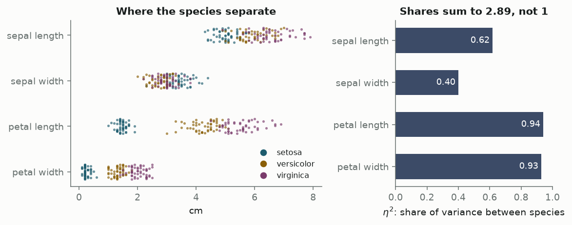
Left, a strip plot of the four measurements coloured by species; petal length and width separate setosa cleanly. Right, bar chart of eta squared: petal length 0.94, petal width 0.93, sepal length 0.62, sepal width 0.40.
Figure 10: Each measurement by species, with the between-species share of its variance.
feature F df p eta^2
sepal length 119.3 2, 147 1.67e-31 0.6187
sepal width 49.16 2, 147 4.492e-17 0.4008
petal length 1180 2, 147 2.857e-91 0.9414
petal width 960 2, 147 4.169e-85 0.9289

Petal length reaches \(\eta^2\) = 0.941: knowing the species accounts for 94.1% of its variation. All four F statistics are enormous and the largest of the four p-values is 4e-17, which is the expected result for three species a botanist can tell apart by eye. The interesting content is in the shares, not the significance — with 50 flowers per group, a test this powerful was never going to say anything else.

Caveat: these shares sum to 2.89

Which is impossible for shares of one thing. Each row is a separate one-way ANOVA on a single measurement, so each answers “how much of this column’s variance is between-species” in isolation. Sepal length scores 0.62 in large part because it correlates at 0.872 with petal length; it is credited for variation that petal length would also claim.

Univariate variance decomposition is therefore a marginal attribution — what each part explains on its own — while a regression coefficient is a conditional one, holding the others fixed. Both are legitimate and they answer different questions, which is why the two tables above rank the sepals so differently. Any attribution method, in either tradition, has to make this choice, and most do it silently.

PCA: localizing to directions instead of to features

The three methods so far all take the measured feature as the unit. Principal component analysis gives that up. Its parts are linear combinations of the measurements, chosen so each successive direction captures as much of the remaining variance as it can — buying concentration at the cost of nameability.

def pca_fit(X: np.ndarray, standardised: bool = True, k: int = 2) -> PCAFit:
    Z = standardise(X) if standardised else X - X.mean(0)
    U, S, Vt = np.linalg.svd(Z, full_matrices=False)
    var = S**2 / (len(Z) - 1)
    # Sign convention: make each component's largest-magnitude loading positive,
    # so the biplot does not flip between runs or between standardisations.
    V = Vt.T
    flip = np.sign(V[np.abs(V).argmax(0), np.arange(V.shape[1])])
    V = V * flip
    scores = Z @ V
    return PCAFit(
        ratio=var / var.sum(),
        loadings=V[:, :k],
        scores=scores[:, :k],
        standardised=standardised,
    )
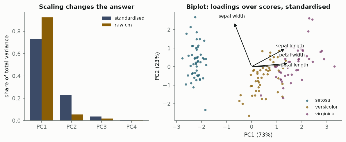
Left, a bar chart comparing explained variance ratios for standardised and raw-centimetre PCA. Right, a biplot of the first two standardised components with the three species separated and four loading arrows.
Figure 11: Left: explained variance under two scalings. Right: the standardised biplot, loadings drawn over scores.

On standardised data the first two components carry 95.8% of the variance, and the biplot shows why Iris is a teaching set: setosa is cleanly detached along PC1, versicolor and virginica overlap slightly. The loadings say what PC1 means — petal length 0.58, petal width 0.56, sepal length 0.52, sepal width -0.27 — a general size axis with sepal width running against it.

The left panel carries the caveat, and it is a sharp one. Run the same decomposition on raw centimetres and PC1 accounts for 92.5% rather than 73.0%, with a loading of 0.86 on petal length alone. Unstandardised PCA maximises variance in the units the data happens to be recorded in, and petal length simply has the widest range in centimetres. The “explanation” changed because someone chose a scale. Note that this is not a defect unique to PCA — occlusion in Part I depended on the fill value in exactly the same way, and for exactly the same reason.

Permutation importance: occlusion, moved to a table

The last method is the ML tradition’s, and it is here to close the loop. Take the fitted model, shuffle one column of the held-out set to break its link with the label while leaving its marginal distribution untouched, and measure the accuracy lost. That is occlusion, with a column in place of a patch and a permutation in place of a black square.

def permutation_importance(
    predict, X: np.ndarray, y: np.ndarray, repeats: int, rng: np.random.Generator
) -> pd.DataFrame:
    baseline = float((predict(X) == y).mean())
    rows = []
    for j, name in enumerate(FEATURES):
        drops = np.empty(repeats)
        for r in range(repeats):
            Xp = X.copy()
            Xp[:, j] = Xp[rng.permutation(len(Xp)), j]
            drops[r] = baseline - float((predict(Xp) == y).mean())
        rows.append(
            {
                "feature": name,
                "mean drop": drops.mean(),
                "sd": drops.std(ddof=1),
                "se": drops.std(ddof=1) / np.sqrt(repeats),
            }
        )
    return pd.DataFrame(rows)
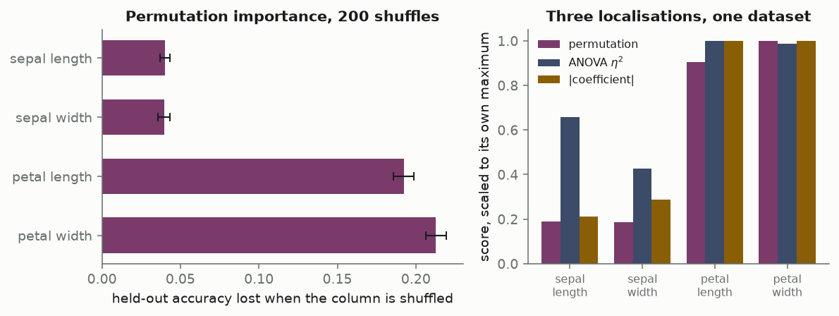
Left, a bar chart of accuracy lost per shuffled feature with error bars: petal width 0.21, petal length 0.19, both sepals 0.04. Right, grouped bars comparing permutation importance, ANOVA eta squared and absolute coefficient.
Figure 12: Permutation importance with 95% intervals from 200 shuffles, and the three localizations side by side, each scaled to its own maximum.
feature mean drop sd se
sepal length 0.0402 0.0224 0.0016
sepal width 0.0395 0.0279 0.0020
petal length 0.1922 0.0468 0.0033
petal width 0.2127 0.0470 0.0033

On a 60-flower held-out set the multinomial model scores 95.0%, and shuffling petal width costs it 0.213 of that while shuffling sepal width costs 0.039. The same ordering as the coefficients, from a method that never looks inside the model.

The important part is the error bars, and where they come from. The shuffle is random, so 200 repeats give a distribution of importances rather than a number — the interval is a Monte-Carlo statement about the permutation, not a confidence interval for a parameter, and it says nothing about sampling variability in the 150 flowers. It is a genuinely weaker guarantee than the Wald interval above. But it is a guarantee, obtained by a method that treats the model as a black box, and there is no reason the same trick cannot be applied to an occlusion map: re-run it across seeds, across training runs, across bootstrap resamples of the data, and report the spread.

The right panel is the payoff. Three methods, three notions of a part, one dataset, and they agree closely on the petals and disagree on the sepals — with ANOVA rating sepal length far above the other two, exactly as the marginal-versus-conditional distinction predicts. Disagreement between attribution methods is not usually a sign that one is broken. It is usually a sign that they were asked different questions.

Where the two traditions meet

Eight methods, one framing. Laid against the three axes from the opening, the pattern is not that machine learning and statistics do different things — it is that they have covered different parts of the same grid.

Method Part Responsible means Uncertainty
Saliency pixel large local gradient none
Occlusion image patch logit lost when blanked none as computed
Grad-CAM conv channel active and gradient-weighted none
Integrated gradients pixel path integral from a baseline none
Logistic coefficient feature log-odds per sd, others fixed Wald interval
ANOVA \(\eta^2\) feature share of between-group variance F test
PCA loading direction variance captured none as computed
Permutation importance feature accuracy lost when shuffled Monte-Carlo interval

The third column is the interesting one. Every method in the table is correlational in the sense that matters: none of them establishes that the part caused the output, only that the output covaries with the part under some manipulation. But they are not all correlational in the same way. Saliency, coefficients and PCA loadings read structure off the fitted object without changing anything. Occlusion, integrated gradients and permutation importance intervene — they construct inputs the model was never trained on and observe the consequence.

That distinction is where the frontier is. Intervening is closer to a causal claim, but the interventions above all push the input off the data manifold: a digit with a black square through it, a flower with one measurement drawn from another flower. The model’s response to an impossible input is not obviously evidence about its behaviour on possible ones. Mechanistic interpretability takes the natural next step — intervene inside the network instead. Activation patching runs the model on two inputs, copies a specific internal activation from one run into the other, and measures how far the output moves, which localizes responsibility to a component under an intervention the network’s own distribution supports. The parts become circuits and attention heads rather than pixels, and the credit rule becomes an experiment rather than a derivative. What it inherits unchanged from everything above is the third column: those results are point estimates too.

The column that is still empty

The two traditions are not really in tension. They have solved adjacent halves of one problem and left the other half open in mirror image. Statistics knows how to attach honest uncertainty to an attribution, and its methods stop scaling somewhere around the point where the parts start interacting in ways no one can write down. Machine learning has attribution methods that run happily on a billion parameters, and almost none of them can tell you whether the number they returned would survive a different seed.

Neither gap is fundamental. Permutation importance already shows the bridge in one direction — repeat the perturbation, report the spread — and nothing prevents an occlusion map from carrying the same treatment. It would cost a hundred forward passes and it is almost never done.

Until then, the honest reading of a saliency map is narrower than it looks. It says: given this model, this input, and this definition of a part, here is where the credit fell. Not that the credit would fall there again.

Reproducing this

Everything above runs from posts/explainability-localization/src/, and every code block on this page is the real source of the function it names, extracted with inspect.getsource at render time rather than copied. See the README for the environment, the runtimes and the list of build-time checks.

References