flowchart LR
  subgraph nested [Nested design]
    samples["75 samples"] --> matrixX["X: 75 x 285"]
    samples --> partition["19 Control / 30 Mild / 26 Severe"]
  end
  subgraph crossed [Crossed design]
    donor["donor"] --> cube["donor x condition x metabolite"]
    condition["condition"] --> cube
    metabolite["metabolite"] --> cube
  end
A classifier will separate these three COVID neutrophil groups. That is the easy trick. Clustering, which does not get the labels, does not recover the same partition.
Seventy-five people, 285 metabolites, three tags on rows. The usual next move is to average each tag and draw a line through those three points, then treat the leftover as a second disease direction. That geometry is always defined. It is not a model of the people. One Control profile already sits far from the Control mean. The clouds overlap. A line through the means never sees that.
Li et al. (2023) isolated neutrophils from 75 people, extracted two million cells each, and deposited LC-MS peak areas as Metabolomics Workbench ST002477 (CC BY 4.0). They wanted the cell that kills, not plasma. The numbers are relative ion intensities, not counts and not fluxes. The job that fits the file is whether the 75 rows form three blobs that match the labels.
1 Neutrophil metabolomes
Plasma metabolomes mix liver, muscle, and lunch. This table is one cell type: the neutrophil, the cell that does the killing.
Neutrophils eat microbes, dump oxidants, and throw DNA nets (NETs). That work runs on glycolysis and the pentose-phosphate pathway (Morrison, Watts, Sadiku, and Walmsley 2022). In severe COVID-19 these cells pile up in failing lungs. If their fuel is off, killing and damage move together. Li et al. saw amino-acid, redox, and central-carbon pools shift, and showed GAPDH can suppress NET formation. Peak area is not that flux. It is still the public readout of the cell.
Erythrose 4-phosphate sits on the pathway that powers the oxidant burst (Britt et al. 2022). Hypotaurine and glycine sit near redox handling. Those names only help after the 75 people have been treated as 75 people.
2 Source table
75 profiles: 19 Control, 30 Mild, 26 Severe. 287 named rows, 285 unique vectors. Chromatogram peak areas from a targeted Q Exactive method, median-normalised per sample. Nonnegative and continuous. Not integer counts.
| metabolite | PMN_74 (C) | PMN_75 (C) | PMN_02 (M) | PMN_03 (M) | PMN_48 (S) | PMN_49 (S) |
|---|---|---|---|---|---|---|
| Hypotaurine | 6.97e+08 | 3.66e+08 | 5.58e+08 | 1.39e+08 | 9.88e+08 | 6.45e+08 |
| Glycine | 1.07e+08 | 8.54e+07 | 7.55e+07 | 8.73e+07 | 9.30e+07 | 1.09e+08 |
| Erythrose 4-phosphate | 1.06e+06 | 5.94e+06 | 2.67e+06 | 3.12e+06 | 3.40e+04 | 1.85e+05 |
| 1,3/ 2,3-Bisphosphoglycerate | 6.71e+04 | 1.11e+05 | 1.73e+06 | 3.79e+07 | 2.28e+05 | 5.03e+06 |
| Creatine | 9.06e+09 | 6.27e+09 | 9.80e+09 | 7.02e+09 | 8.04e+09 | 1.49e+10 |
| Uridine monophosphate | 4.36e+07 | 1.39e+06 | 1.54e+06 | 1.98e+06 | 1.64e+06 | 1.68e+06 |
Relative peak areas, two samples per group. The range is normal for ion intensity. It is not a count table.
3 Matrix layout
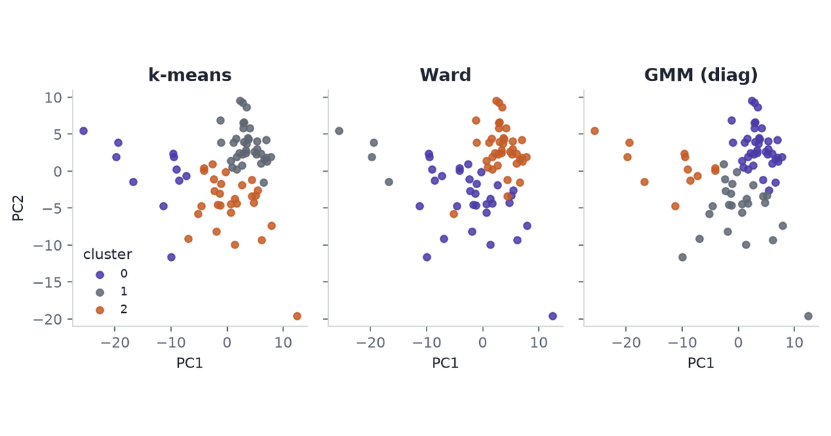
Each person is one row. Each metabolite is one column. \(X \in \mathbb{R}^{75 \times 285}\). Control, Mild, and Severe partition those rows. They do not add a third index.
A tensor mode can vary on its own. Here each person sits in one group. sample × metabolite × group leaves two slices empty for every person. CP on that cube would spend rank explaining holes the design made.
Group would be a third mode if the same people were measured in all three states. This cohort is one snapshot per person. Raw chromatograms could still be sample × retention time × m/z. Those files are not in the public table.
4 Clustering
The labels are a hypothesis about density: three blobs, 75 points. Clustering tests that without being handed the tags.
\(k=3\) is borrowed from the label count. It is not chosen by silhouette, BIC, or a gap statistic. Those criteria need a held-out split or a stable bootstrap. 75 rows, 285 columns, and groups of 19 / 30 / 26 do not give one. Hyperparameter Tuning in Clustering is the case where a validation split exists. This file is not that case.
Three algorithms, scikit-learn defaults, same log1p/IQR matrix \(Z\):
- k-means. Three spherical averages. This is averaging, without using the COVID tags.
- Ward agglomerative. Merge by increase in within-cluster sum of squares.
- Diagonal Gaussian mixture. One variance per metabolite. A full covariance per component cannot be fit: each would want \(\sim 40{,}000\) parameters on 75 rows.
Agreement with the COVID labels is the adjusted Rand index (ARI). Chance is 0. A match is 1.
Code
print(f"k-means ARI = {aris['k-means']:.2f}")
print(f"Ward ARI = {aris['Ward']:.2f}")
print(f"GMM (diag) ARI = {aris['GMM (diag)']:.2f}")
print(f"COVID-label silhouette = {label_sil:.2f}")
for name, pred in clusterings.items():
    print(f"{name} sizes = {list(np.bincount(pred))}")
k-means ARI = 0.14
Ward ARI = 0.18
GMM (diag) ARI = 0.23
COVID-label silhouette = 0.05
k-means sizes = [np.int64(11), np.int64(36), np.int64(28)]
Ward sizes = [np.int64(32), np.int64(4), np.int64(39)]
GMM (diag) sizes = [np.int64(38), np.int64(25), np.int64(12)]k-means
| label | 0 | 1 | 2 |
|---|---|---|---|
| Control | 9 | 3 | 7 |
| Mild | 2 | 13 | 15 |
| Severe | 0 | 20 | 6 |
Ward
| label | 0 | 1 | 2 |
|---|---|---|---|
| Control | 13 | 3 | 3 |
| Mild | 16 | 1 | 13 |
| Severe | 3 | 0 | 23 |
GMM (diag)
| label | 0 | 1 | 2 |
|---|---|---|---|
| Control | 3 | 5 | 11 |
| Mild | 13 | 16 | 1 |
| Severe | 22 | 4 | 0 |
ARI is 0.14 (k-means), 0.18 (Ward), 0.23 (diagonal GMM). Mild splits across clusters in all three. Ward’s middle cluster has four people. The COVID labels themselves have silhouette 0.05 on \(Z\): they are not compact blobs. k-means and Ward, which do not use the labels, still only reach silhouette 0.09.
Code
fig, axes = plt.subplots(1, 3, figsize=(8, 3.2), sharex=True, sharey=True)
for ax, (name, pred) in zip(axes, clusterings.items()):
    for cluster_id in range(3):
        pts = pc_scores[pred == cluster_id]
        ax.scatter(
            pts[:, 0],
            pts[:, 1],
            s=22,
            color=CLUSTER_COLOURS[cluster_id],
            alpha=0.85,
            label=f"{cluster_id}",
        )
    ax.set_title(name)
    ax.set_xlabel("PC1")
axes[0].set_ylabel("PC2")
axes[0].legend(frameon=False, title="cluster", loc="lower left", fontsize=8)
fig.tight_layout()
letterbox_cover(fig)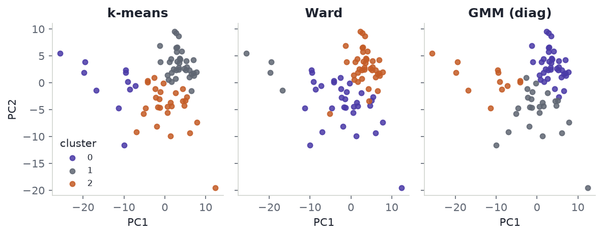
A spectral clustering with nearest-neighbour affinity can be pushed toward ARI \(\approx 0.3\) by changing the neighbour count. That move is tuning. 75 points will not carry it.
5 PCA
Do the 75 people separate, or only a labelled mean?
Code
print(f"PC1 variance fraction = {pc_var[0]:.2f}")
print(f"PC2 variance fraction = {pc_var[1]:.2f}")
for group in GROUPS:
    centre = pc_scores[labels == group].mean(axis=0)
    print(f"{group} mean PC1 = {centre[0]:.2f}, mean PC2 = {centre[1]:.2f}")
PC1 variance fraction = 0.21
PC2 variance fraction = 0.11
Control mean PC1 = -6.95, mean PC2 = 0.13
Mild mean PC1 = 1.75, mean PC2 = -2.23
Severe mean PC1 = 3.06, mean PC2 = 2.48Code
fig, ax = plt.subplots()
for group in GROUPS:
    pts = pc_scores[labels == group]
    ax.scatter(pts[:, 0], pts[:, 1], s=28, color=COLOURS[group], alpha=0.85, label=group)
ax.set_xlabel("PC1")
ax.set_ylabel("PC2")
ax.legend(frameon=False)
fig.tight_layout()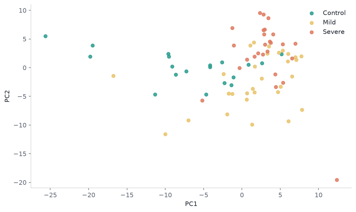
PC1 holds 21% of sample variance; PC2 holds 11%. Group means on PC1: Control −6.95, Mild 1.75, Severe 3.06. On PC2, Mild (−2.23) sits opposite Severe (2.48). People overlap. One Control sits near PC1 \(= -25\). That tail moves the Control mean. The cluster panels are this same plane, recoloured.
6 Volcano
Clustering asks whether the rows form blobs. A volcano plot asks which columns differ. Both can be true at once: many metabolites shift, and the 75 people still overlap.
Welch’s t-test on \(\log_2(1 + \text{peak area})\), one contrast at a time. Benjamini–Hochberg \(q\) within each contrast’s 285 tests. \(k\) is not involved. The x-axis is the difference of group means on that log2 scale, not a fold-change of the raw averages.
Code
for name, (lfc, p_values, q_values) in volcanoes.items():
    print(f"{name} q<0.05 = {int((q_values < 0.05).sum())} / {q_values.size}")
e4p = int(np.flatnonzero(feature_names == "Erythrose 4-phosphate")[0])
for name, (lfc, p_values, q_values) in volcanoes.items():
    print(f"{name} E4P lfc = {lfc[e4p]:.2f}, q = {q_values[e4p]:.2g}")
Mild vs Control q<0.05 = 108 / 285
Severe vs Control q<0.05 = 134 / 285
Mild vs Control E4P lfc = -0.09, q = 0.92
Severe vs Control E4P lfc = -4.45, q = 1.6e-07Code
UP = "#C45C26"
DOWN = "#2A9D8F"
fig, axes = plt.subplots(1, 2, figsize=(8, 3.6), sharey=True)
annotate = {
    "Mild vs Control": [("Fucose 1-phosphate", 6, 8)],
    "Severe vs Control": [("Erythrose 4-phosphate", 8, -12)],
}
for ax, (name, (lfc, p_values, q_values)) in zip(axes, volcanoes.items()):
    y = -np.log10(np.clip(p_values, 1e-300, 1.0))
    hit = q_values < 0.05
    ax.scatter(lfc[~hit], y[~hit], s=14, color=RULE, alpha=0.85, linewidths=0)
    ax.scatter(lfc[hit & (lfc > 0)], y[hit & (lfc > 0)], s=16, color=UP, linewidths=0)
    ax.scatter(lfc[hit & (lfc <= 0)], y[hit & (lfc <= 0)], s=16, color=DOWN, linewidths=0)
    ax.axhline(-np.log10(0.05), color=MUTED, ls=":", lw=0.8)
    ax.set_title(name)
    ax.set_xlabel(r"mean $\log_2(1+x)$ difference")
    for metabolite, dx, dy in annotate[name]:
        idx = int(np.flatnonzero(feature_names == metabolite)[0])
        ax.annotate(
            metabolite,
            (lfc[idx], y[idx]),
            textcoords="offset points",
            xytext=(dx, dy),
            fontsize=8,
            color=INK,
        )
axes[0].set_ylabel(r"$-\log_{10} p$")
fig.tight_layout()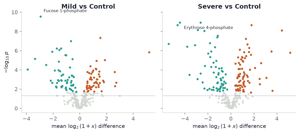
108 metabolites at \(q<0.05\) for Mild vs Control; 134 for Severe vs Control. Erythrose 4-phosphate is a top Severe vs Control hit (\(\log_2\) difference \(-4.45\), \(q=1.6\times 10^{-7}\)) and is not called in Mild vs Control (\(q=0.92\)). A line through the three group means would have treated that name as a severity coordinate. It is a Severe-specific drop.
Many columns move. The rows still do not form three blobs. That is why averaging the groups and fitting a line is the wrong summary of this file.
7 Group means
Three class means in 285 dimensions are three points. They always sit in a plane. A least-squares line through Control and Severe, with Mild parked at some \(t\), is then a statement about those three points, not about 75 people.
\[ \kappa(t)=\bar x_{\mathrm{Mild}}-\bigl[(1-t)\bar x_{\mathrm{Control}}+t\bar x_{\mathrm{Severe}}\bigr]. \]
The midpoint model is \(t=0.5\). Ordinary least squares on the means puts Mild at \(t=0.69\), with 28% of the between-group sum of squares off the line. Both numbers are exact for this transform. They do not say the people lie on a severity axis. Control and Severe define the chord. Mild’s residual is what is left once you have already replaced each group by its average. k-means does that replacement without the labels and still does not recover them.
Code
print(f"t_hat = {t_hat:.2f}")
print(f"off-line fraction of between-group SS = {off_line:.2f}")
t_hat = 0.69
off-line fraction of between-group SS = 0.28Code
chord = float(np.linalg.norm(delta))
fig, ax = plt.subplots()
ax.plot([0.0, chord], [0.0, 0.0], color=LINE, lw=1.8, zorder=1)
ax.plot([t_hat * chord, t_hat * chord], [0.0, float(np.linalg.norm(kappa))], color=MUTED, ls="--", lw=1.2)
points = {
    "Control": (0.0, 0.0),
    "Mild": (t_hat * chord, float(np.linalg.norm(kappa))),
    "Severe": (chord, 0.0),
}
for group, (x, y) in points.items():
    ax.scatter([x], [y], s=90, color=COLOURS[group], zorder=3, label=group)
    ax.annotate(group, (x, y), textcoords="offset points", xytext=(8, 8), color=INK)
ax.set_xlabel("Position on the Control–Severe chord")
ax.set_ylabel("Residual")
ax.legend(frameon=False, loc="upper left")
fig.tight_layout()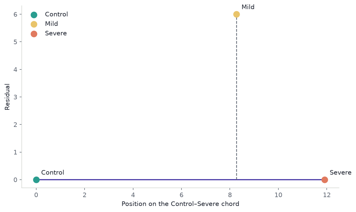
The volcano already named the metabolites that move. The three averages add a \(t\) and a leftover that the 75 people do not occupy.
Rank one of the three centroids is the line. Rank two is the leftover. Rank three is empty. CP on the 75 × 285 table is SVD. Padding groups into a cube does not change that.
8 Downstream models
Use the people. Do not replace them with three averages.
- Clustering with \(k=3\), a few algorithms, no search over \(k\). The labels are not the blobs.
- PCA of people. The plane the cluster colours sit on. Individuals overlap.
- Welch t-tests with Benjamini–Hochberg \(q\), one contrast at a time. The volcano in this post. Method notes in The Anatomy of a Volcano Plot.
- Sparse PLS or elastic net, group-stratified CV, only to rank features. 75 people will not carry a biomarker; see From Dataset to Biological Signature.
- CP / PARAFAC only on a real cube: chromatograms, or the same donors in more than one state. Uses of Tensor Factorizations is that case. This file is not.
Skip an unregularised 285-feature classifier, a deep net, Poisson models, NMF on Li et al.’s signed Dataset 3, and a severity score built from the three means.
scikit-learn for k-means, Ward, GMM, ARI, and PCA. SciPy for Welch’s t-test. MetaboAnalyst for tables (Pang et al. 2021). mixOmics / ropls for PLS. MZmine, XCMS, pyOpenMS, matchms for chromatograms. TensorLy for PARAFAC (Bro 1997).
9 Constraints
This is one transform of one matrix, not a biomarker panel.
- Peak area is not flux and not NETs.
- A deposited name is not a confirmed structure. Forty lipids are sum-composition labels.
- Groups are not time. One cohort is not a replication. Bulk pellets mix cell-state with within-cell change.
- \(k=3\) was taken from the labels. ARI 0.14–0.23 and silhouette 0.05 move if the transform moves.
- \(q<0.05\) counts (108 and 134) are per-contrast Benjamini–Hochberg on 285 Welch tests of \(\log_2(1+x)\). They move if the transform or the contrast set moves.
- A full-covariance GMM, a neighbour count for spectral clustering, and a search over \(k\) are tuning. 75 rows will not support them.
Labels. Are. Not. Clusters. Means. Are. Not. People. Leave. k. Alone.
10 References
- Britt, E. C., et al. (2022). Switching to the cyclic pentose phosphate pathway powers the oxidative burst in activated neutrophils. Nature Metabolism. doi:10.1038/s42255-022-00550-8
- Bro, R. (1997). PARAFAC. Tutorial and applications. Chemometrics and Intelligent Laboratory Systems 38: 149–171. doi:10.1016/S0169-7439(97)00032-4
- Information retained and lost by a shared linear mean axis in COVID-19 neutrophil metabolomics. Research Square preprint
rs-10583501. doi:10.21203/rs.3.rs-10583501/v1 - Li, Y., et al. (2023). Neutrophil metabolomics in severe COVID-19 reveal GAPDH as a suppressor of neutrophil extracellular trap formation. Nature Communications 14: 2610. doi:10.1038/s41467-023-37567-w
- Metabolomics Workbench ST002477 / PR001600. doi:10.21228/M8W70C
- Morrison, T., Watts, E. R., Sadiku, P., and Walmsley, S. R. (2022). The emerging role for metabolism in fueling neutrophilic inflammation. Immunological Reviews. doi:10.1111/imr.13157
- Pang, Z., et al. (2021). MetaboAnalyst 5.0: narrowing the gap between raw spectra and functional insights. Nucleic Acids Research. doi:10.1093/nar/gkab382
- From Dataset to Biological Signature
- Hyperparameter Tuning in Clustering
- The Anatomy of a Volcano Plot
- Uses of Tensor Factorizations