Uses and Abuses of Topological Data Analysis: A Pragmatic Guide
Machine Learning
Topology
Author
Ravi Kalia
Published
July 23, 2026
Uses and Abuses of Topological Data Analysis: A Pragmatic Guide
Density methods (k-means, KDE, GMM) answer where mass concentrates. Topological data analysis (TDA) answers connectivity: gaps, loops, tunnels, voids. A filled disk and an annulus can share uniform local density but differ in topology.
1 Density vs shape
Standard ML tools are density-driven:
K-means, KDE, GMM: where points pile up.
Random forests: regions where labels concentrate.
TDA asks how the point cloud is connected across scales, without committing to one distance threshold upfront.
Shape signal appears in periodic dynamics (loops in phase space), cyclic chemistry, seasonal regimes, neural population trajectories — structures no clustering algorithm reports as holes.
2 Vietoris-Rips filtration
Fix \(\varepsilon \geq 0\). Include a simplex on every subset whose pairwise distances are \(\leq \varepsilon\).
Simplices:
0-simplex: point.
1-simplex: edge.
2-simplex: filled triangle.
3-simplex: solid tetrahedron.
Simplicial complex: collection closed under faces (every face of an included simplex is included).
Sweep \(\varepsilon\) from 0 upward → nested filtration of complexes. TDA studies the full sweep, not one scale.
2.1 Three-point example
Data provenance (synthetic): three hand-placed points A, B, C forming a loose triangle with distinct side lengths.
Table 1
import numpy as npfrom scipy.spatial.distance import pdist, squareform# Three points forming a loose triangle: A, B, Cpts = np.array([[0.0, 0.0], # A [1.0, 0.0], # B [0.6, 1.3]]) # Clabels = ["A", "B", "C"]D = squareform(pdist(pts))print("Pairwise distance matrix (rows/cols = A, B, C):")print(np.round(D, 3))print(f"\nd(A,B) = {D[0,1]:.3f} d(B,C) = {D[1,2]:.3f} d(A,C) = {D[0,2]:.3f}")
import matplotlib.pyplot as pltfrom itertools import combinationsPURPLE, ORANGE ="#4A3AA7", "#E07B39"eps_frames = [0.0, 1.0, 1.36, 1.432]fig, axes = plt.subplots(1, 4, figsize=(15, 4))for ax, eps inzip(axes, eps_frames):# radius-eps/2 disks: two disks touch exactly when centers are eps apartfor (x, y) in pts: ax.add_patch(plt.Circle((x, y), eps /2, color=PURPLE, alpha=0.10, zorder=0))# filled 2-simplex: present when ALL three pairwise distances <= epsifall(D[i, j] <= eps for i, j in combinations(range(3), 2)): ax.add_patch(plt.Polygon(pts, closed=True, color=ORANGE, alpha=0.35, zorder=1))# 1-simplices (edges): present when that pair's distance <= epsfor i, j in combinations(range(3), 2):if D[i, j] <= eps: ax.plot(*zip(pts[i], pts[j]), color=PURPLE, lw=2.5, zorder=2)# 0-simplices (the points themselves) ax.scatter(pts[:, 0], pts[:, 1], s=90, color="black", zorder=3)for (x, y), lab inzip(pts, labels): ax.annotate(lab, (x, y), textcoords="offset points", xytext=(8, 8), fontweight="bold") ax.set_title(fr"$\varepsilon = {eps:g}$") ax.set_aspect("equal"); ax.set_xlim(-0.9, 1.9); ax.set_ylim(-0.9, 2.2) ax.set_xticks([]); ax.set_yticks([])plt.tight_layout()plt.show()
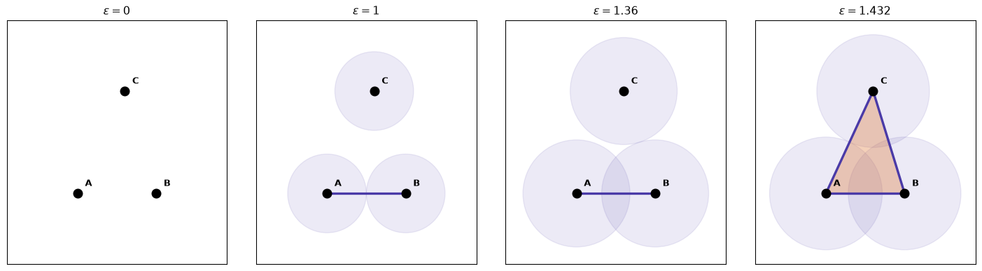
Figure 1: The Vietoris–Rips filtration on three points, at four thresholds. Faint circles have radius ε/2, so two points connect (an edge appears) exactly when their circles touch. Nodes are born at ε=0, the A–B edge at ε=1.000, the B–C edge at ε=1.360, and at ε=1.432 the last edge closes the loop and the triangle fills in the same instant.
Frame sequence:
\(\varepsilon = 0\): three isolated components.
\(\varepsilon = 1.000\): edge A–B; two components.
\(\varepsilon = 1.360\): edge B–C; one component, open path.
\(\varepsilon = 1.432\): triangle closes and fills simultaneously; no persistent loop.
\(H_0\): three bars born at 0; deaths at 1.000, 1.360; one immortal component.
\(H_1\): empty — loop born and killed at \(\varepsilon = 1.432\) (zero persistence).
Persistence diagram: (birth, death) per feature; signal far from diagonal; noise near diagonal. Barcode: same intervals as horizontal bars.
2.3 Noisy circle
Data provenance (synthetic): 80 uniform angles on the unit circle + Gaussian noise (\(\sigma = 0.08\)), seed 7. Stands in for cyclic processes with measurement error. Ground truth: one loop.
Code
import numpy as npimport matplotlib.pyplot as pltfrom ripser import ripserfrom persim import plot_diagrams# House palette (CVD-validated purple / orange two-series).PURPLE, ORANGE ="#4A3AA7", "#E07B39"# --- Synthetic data: 80 points on the unit circle + Gaussian noise ---rng = np.random.default_rng(7)n =80theta = rng.uniform(0, 2* np.pi, n)circle = np.column_stack([np.cos(theta), np.sin(theta)])circle += rng.normal(scale=0.08, size=circle.shape)# --- Persistent homology up to H1 (loops) ---result = ripser(circle, maxdim=1)dgms = result["dgms"] # dgms[0] = H0 components, dgms[1] = H1 loopsfig, axes = plt.subplots(1, 3, figsize=(14, 4.2))# Panel 1: the point cloudaxes[0].scatter(circle[:, 0], circle[:, 1], s=28, color=PURPLE, edgecolor="white", linewidth=0.5)axes[0].set_title("Noisy circle (point cloud)")axes[0].set_aspect("equal")axes[0].set_xlabel("x"); axes[0].set_ylabel("y")# Panel 2: barcode (drawn by hand so we control the two-series palette)ax = axes[1]y =0colors = {0: PURPLE, 1: ORANGE}labels_done =set()for dim in (0, 1): bars = dgms[dim] finite = bars[np.isfinite(bars[:, 1])]for birth, death insorted(finite, key=lambda b: b[0]): lbl =f"$H_{dim}$"if dim notin labels_done elseNone ax.plot([birth, death], [y, y], color=colors[dim], lw=2.5, label=lbl, solid_capstyle="round") labels_done.add(dim) y +=1ax.set_title("Barcode")ax.set_xlabel(r"filtration scale $\varepsilon$")ax.set_yticks([])ax.legend(loc="lower right", frameon=False)# Panel 3: persistence diagram (persim handles H0/H1 coloring + diagonal)plot_diagrams(dgms, ax=axes[2], show=False)axes[2].set_title("Persistence diagram")plt.tight_layout()plt.show()
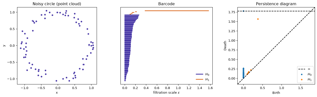
Figure 2: A noisy circle (left) and the persistent homology of its Vietoris–Rips filtration, shown as a barcode (center) and a persistence diagram (right). The single long H1 bar / high off-diagonal point is the loop.
One long \(H_1\) bar / off-diagonal point = the ring’s topological signal.
3 Four application patterns
Applied persistent homology commonly follows one of four patterns:
3.1 Pattern A: diagram → feature vector
Topology as feature expander: vectorize diagrams (persistence image, landscape, Betti-curve samples, summary statistics) and concatenate with tabular features for standard classifiers.
Bhatia et al.: link prediction via neighbourhood persistence descriptors.
Minamitani et al.: amorphous materials structure–property prediction.
Ismail et al.; Gidea & Katz: financial time-series crash early warning via delay embedding.
Most common pattern; also the most often applied without justification.
3.2 Pattern B: diagram as test statistic
No downstream learner. Diagram or scalar summary (Betti count, total persistence) compared to a null distribution.
Representative uses:
Pranav et al.; Wilding et al.: cosmic web topology vs \(\Lambda\)CDM simulations / Gaussian fields.
Wright & Zheng: Wikipedia word embeddings vs noise baselines.
Signature: null model + p-value; no trained predictor.
3.3 Pattern C: topological object as deliverable
No vectorization; human reads the output. Mapper: lens function → overlapping bins → local clustering → graph of clusters.
Representative uses:
Nicolau, Levine & Carlsson: breast cancer subtyping (Ayasdi lineage).
Rizvi et al.: single-cell differentiation trajectories.
Xia & Wei; Stolz et al.: protein and DNA topological structure.
Exploratory; success = domain insight, not held-out accuracy.
3.4 Pattern D: distance between diagrams
Compare whole diagrams via bottleneck or Wasserstein distance.
Representative use:
Hajij et al.: time-varying graphs; diagram distance flags structural change.
Signature: inter-diagram distance as the quantity of interest.
4 Iris benchmark
Data provenance: UCI Iris — 150 flowers, four measurements (sepal/petal length and width), three species.
Collector: Edgar Anderson (botanical variation study).
Fisher (1936): introduced linear discriminant analysis on this table.
Geometry: Setosa separated; Versicolor and Virginica overlap.
Task here: diagnostic — does global/local topology add signal beyond four measurements? Wrong species label has no real-world cost on this teaching set.
Topology should be redundant when raw features already separate species; any gain measures marginal value of shape descriptors.
Patterns exercised: global \(H_0\) (B/C), Mapper (C), local persistence landscapes (A).
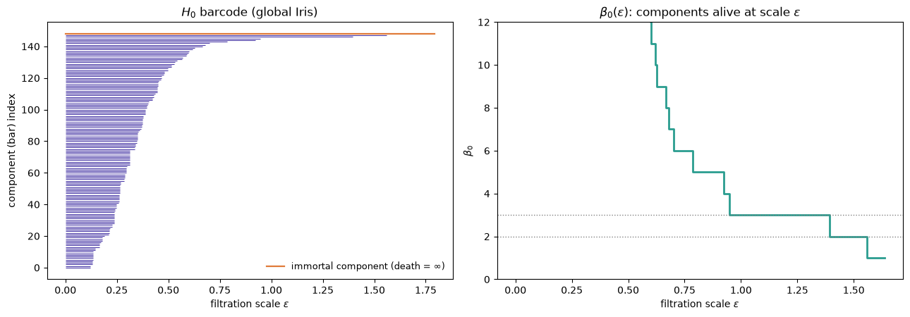
Figure 3: Global H0 of standardized Iris. Left: the H0 barcode — 149 bars born at ε=0, all but one dying as clumps merge; the two longest finite bars are the last merges. Right: β0(ε), the number of components alive at each scale. The wide plateau at β0=3, then β0=2, is the persistent cluster structure.
Plateaus: \(\beta_0 = 3\) then \(\beta_0 = 2\) before collapse to 1. \(H_0\) filtration equals single-linkage merge order.
from scipy.cluster.hierarchy import linkage, fclusterfrom scipy.spatial.distance import pdistZ = linkage(pdist(X), method="single") # single-linkage == H0 merge orderfor k in (2, 3): lab = fcluster(Z, t=k, criterion="maxclust") comp = {c: np.bincount(y[lab == c], minlength=3) for c in np.unique(lab)}print(f"{k} components:")for c, b in comp.items():print(f" cluster {c}: setosa={b[0]:2d} versicolor={b[1]:2d} virginica={b[2]:2d}")
2 components: all 50 Setosa vs 100 Versicolor+Virginica (clean).
3 components: one stray Setosa outlier; Versicolor and Virginica remain fused (single-linkage chaining).
Global \(H_0\) sees Setosa as topologically distinct; cannot split the overlapping pair.
4.2 Mapper graph
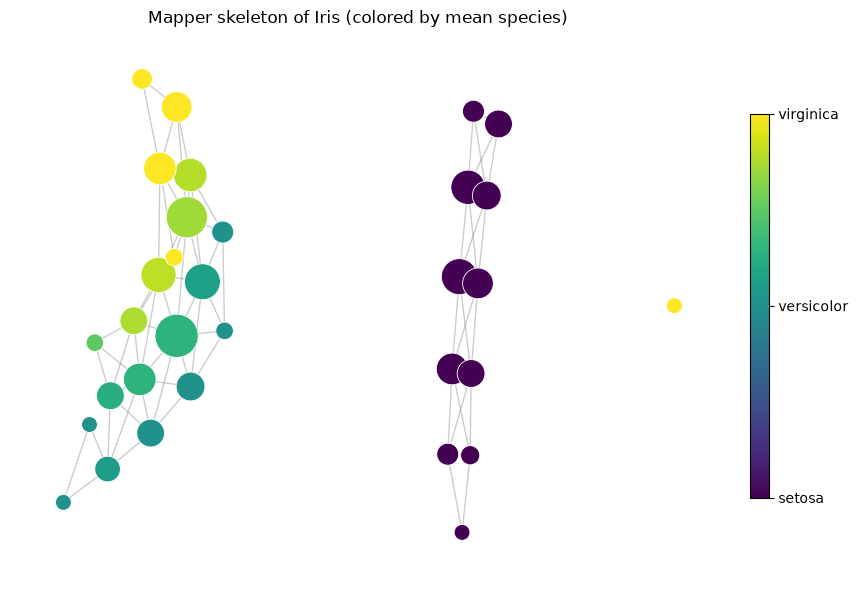
Pattern C: lens = first two PCA components; bin clustering = DBSCAN; nodes coloured by mean species label (labels not used in construction).
Code
import warnings; warnings.filterwarnings("ignore")import kmapper as kmimport networkx as nxfrom sklearn.cluster import DBSCANfrom sklearn.decomposition import PCAfrom matplotlib.cm import ScalarMappablefrom matplotlib.colors import Normalizemapper = km.KeplerMapper(verbose=0)lens = mapper.fit_transform(X, projection=PCA(n_components=2), scaler=None)graph = mapper.map(lens, X, cover=km.Cover(n_cubes=8, perc_overlap=0.4), clusterer=DBSCAN(eps=1.2, min_samples=3))G = nx.Graph()node_color, node_size = {}, {}for node, members in graph["nodes"].items(): G.add_node(node) node_color[node] = y[members].mean() # 0=setosa ... 2=virginica node_size[node] =40+30*len(members)for src, dsts in graph["links"].items():for d in dsts: G.add_edge(src, d)# Lay out each connected component on its own, then space the components apart# horizontally so that disconnection is visually unambiguous.pos = {}x_offset =0.0for cc insorted(nx.connected_components(G), key=len, reverse=True): sub = G.subgraph(cc) sub_pos = nx.spring_layout(sub, seed=1, k=0.6) xs = [p[0] for p in sub_pos.values()] span = (max(xs) -min(xs)) iflen(xs) >1else1.0for node, (px, py) in sub_pos.items(): pos[node] = (px + x_offset, py) x_offset += span +1.4# gap between componentscmap = plt.cm.viridisfig, ax = plt.subplots(figsize=(9, 6))nx.draw_networkx_edges(G, pos, ax=ax, alpha=0.4, edge_color="gray")nx.draw_networkx_nodes(G, pos, ax=ax, node_color=[node_color[n] for n in G.nodes()], node_size=[node_size[n] for n in G.nodes()], cmap=cmap, vmin=0, vmax=2, edgecolors="white", linewidths=0.6)sm = ScalarMappable(cmap=cmap, norm=Normalize(0, 2)); sm.set_array([])cb = fig.colorbar(sm, ax=ax, ticks=[0, 1, 2], shrink=0.7)cb.ax.set_yticklabels(species)ax.set_title("Mapper skeleton of Iris (colored by mean species)")ax.axis("off")plt.tight_layout()plt.show()print(f"connected components in Mapper graph: {nx.number_connected_components(G)}")
Figure 4: Mapper graph of Iris. Node size ∝ number of member flowers; node color = mean species label of its members (0 Setosa → 2 Virginica). Setosa forms an isolated island; Versicolor and Virginica share one connected, branching structure that grades continuously from one to the other — the topological signature of two overlapping species.
connected components in Mapper graph: 3
Setosa: isolated island. Versicolor–Virginica: one connected graded branch. Small Virginica satellite depends on bin/overlap/DBSCAN settings — exploratory sensitivity, not a p-value.
4.3 Local persistence features
Pattern A: per-flower \(k=15\) nearest neighbours → local \(H_0\) → first persistence landscape sampled at six fixed \(\varepsilon\) values → six extra columns.
from sklearn.neighbors import NearestNeighborsK =15GRID = np.linspace(0.0, 2.0, 6) # 6 fixed ε slices -> 6 features per flowernbrs = NearestNeighbors(n_neighbors=K +1).fit(X)_, idx = nbrs.kneighbors(X) # idx[i] = flower i and its 15 neighborsdef local_landscape(neighbor_pts):"""First H0 persistence landscape, sampled on GRID.""" bars = ripser(neighbor_pts, maxdim=1)["dgms"][0] bars = bars[np.isfinite(bars[:, 1])] # finite H0 bars (births all 0) lam = np.zeros_like(GRID)for b, d in bars: tent = np.clip(np.minimum(GRID - b, d - GRID), 0, None) lam = np.maximum(lam, tent) # upper envelope λ1return lamtopo = np.vstack([local_landscape(X[idx[i]]) for i inrange(len(X))])cols = [f"topo_ε={g:.1f}"for g in GRID]demo = pd.DataFrame(topo, columns=cols)demo.insert(0, "species", [species[t] for t in y])print("Local persistence-landscape features (one row per flower):")print(demo.iloc[[0, 50, 100]].to_string(index=True))
Local persistence-landscape features (one row per flower):
        species  topo_ε=0.0  topo_ε=0.4  topo_ε=0.8  topo_ε=1.2  topo_ε=1.6  topo_ε=2.0
0        setosa         0.0    0.000000         0.0         0.0         0.0         0.0
50   versicolor         0.0    0.281265         0.0         0.0         0.0         0.0
100   virginica         0.0    0.113791         0.0         0.0         0.0         0.0
Setosa rows: all zeros (tight neighbourhood). Versicolor/Virginica: nonzero at \(\varepsilon = 0.4\) only.
from sklearn.ensemble import RandomForestClassifierfrom sklearn.model_selection import cross_val_score, StratifiedKFoldcv = StratifiedKFold(5, shuffle=True, random_state=0)def acc(features):return cross_val_score(RandomForestClassifier(n_estimators=200, random_state=0), features, y, cv=cv).mean()print(f"raw 4 measurements only : {acc(X):.3f}")print(f"topo landscape only (6) : {acc(topo):.3f}")print(f"raw + topo (10 features): {acc(np.hstack([X, topo])):.3f}")
raw 4 measurements only : 0.933
topo landscape only (6) : 0.827
raw + topo (10 features): 0.947
Cross-validated accuracy: raw alone ≈ 0.93; topology alone ≈ 0.83; raw + topo ≈ 0.95. Marginal gain when coordinates already separate species.
5 When not to use TDA
Abuse: Pattern A without evidence of shape signal — persistence as default feature generator.
Diagnostic before decorative:
Plot the persistence diagram.
Is anything far above the diagonal?
Can you name the geometric mechanism (periodicity, exclusion zone, void) in this domain?
If the diagram is diagonal noise and no mechanism is plausible, density methods are cheaper and equally good.
Costs of misuse:
Vietoris–Rips scales combinatorially in \(n\) and homology dimension.
Short-lived diagonal features can be overfit if vectorized carelessly.
TDA is justified when holes, cycles, or multi-scale connectivity carry domain signal (e.g. ring without central density). It runs at full cost on data with no such structure.
Zhou, Y. & Wang, B. Topological Machine Learning for Mixed Numeric and Categorical Data. arXiv:2003.04584. https://arxiv.org/abs/2003.04584
Bhatia, S., Chatterjee, B., Nathani, D. & Kaul, M. Understanding and Predicting Links in Graphs: A Persistent Homology Perspective. arXiv:1811.04049. https://arxiv.org/abs/1811.04049
Minamitani, E. et al. Persistent homology-based descriptor for machine-learning potential of amorphous structures. Journal of Chemical Physics 159, 084101 (2023). https://doi.org/10.1063/5.0159349
Ismail, M. S. et al. Detecting Early Warning Signals of Major Financial Crashes in Bitcoin Using Persistent Homology. IEEE Access 8 (2020). https://doi.org/10.1109/ACCESS.2020.3033701
Pranav, P. et al. The topology of the Cosmic Web in terms of persistent Betti numbers. Monthly Notices of the Royal Astronomical Society 465, 4281–4310 (2017). https://doi.org/10.1093/mnras/stw2862
Wilding, G. et al. Persistent homology of the cosmic web I: Hierarchical topology in ΛCDM cosmologies. Monthly Notices of the Royal Astronomical Society 507, 2968–2990 (2021). https://doi.org/10.1093/mnras/stab2326
Wright, M. & Zheng, X. Topological Data Analysis on Simple English Wikipedia Articles. arXiv:2007.00063. https://arxiv.org/abs/2007.00063
Nicolau, M., Levine, A. J. & Carlsson, G. Topology based data analysis identifies a subgroup of breast cancers with a unique mutational profile and excellent survival. Proceedings of the National Academy of Sciences 108, 7265–7270 (2011). https://doi.org/10.1073/pnas.1102826108
Rizvi, A. H. et al. Single-cell topological RNA-seq analysis reveals insights into cellular differentiation and development. Nature Biotechnology 35, 551–560 (2017). https://doi.org/10.1038/nbt.3854
Xia, K. & Wei, G. W. Persistent homology analysis of protein structure, flexibility, and folding. International Journal for Numerical Methods in Biomedical Engineering 30, 814–844 (2014). https://doi.org/10.1002/cnm.2655
Hajij, M. et al. Visual Detection of Structural Changes in Time-Varying Graphs Using Persistent Homology. arXiv:1707.06683. https://arxiv.org/abs/1707.06683
Anderson, E. The irises of the Gaspe Peninsula. Bulletin of the American Iris Society 59, 2–5 (1935). UCI Iris dataset
Carlsson, G. (2009). Topology and data. Bulletin of the American Mathematical Society46(2), 255–308.