Effect size tells you how much a feature moved; p-values tell you how reliably it moved. Neither ranking is safe on its own, and a widget here lets you watch both fail.
Why statistical significance does not imply biological importance, how the log2 transform makes the two directions comparable, and how a pair of thresholds turns thousands of noisy hypotheses into a shortlist you can defend. With a screening simulation you drive yourself.
Bioinformatics
Python
Statistics
Author
Ravi Kalia
Published
August 19, 2026
1 Volcano plot
A volcano plot places effect size on the horizontal axis and statistical significance on the vertical axis. It is used when thousands of features are tested at once — gene expression, protein abundance, product metrics — and a shortlist must satisfy both magnitude and certainty.
Effect size alone ranks noisy low-abundance features with large apparent fold changes.
Significance alone ranks precisely measured but biologically trivial shifts.
Both gates together define a region of the plane rather than the head of a one-dimensional list.
This post builds the axes, provides an interactive threshold widget on simulated data, and applies the same geometry to a real RNA-seq dataset.
2 One-dimensional rankings
2.1 Simulation design
The simulation below uses four feature populations covering typical assay failure modes:
1,785 unchanged background features (moderate noise).
765 low-abundance unchanged features (high variance; chance fold changes).
300 real but tiny shifts (6–32%; small standard errors → high significance).
150 genuine responders (3–16 fold change).
Each feature has four replicates per group. A two-sample \(t\)-test uses sample variance (not assumed), so a feature can clear significance on a lucky small variance estimate.
Three selection rules share the same budget — the candidate count from the dual filter — and recovery of the 150 genuine responders is counted.
Code
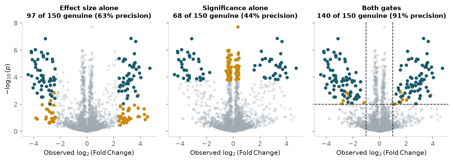
rng = np.random.default_rng(42)N, N_TRUE, N_MICRO, N_REP =3000, 150, 300, 4n_noisy =round(0.30* (N - N_TRUE - N_MICRO))n_null = N - N_TRUE - N_MICRO - n_noisydef block(size, lfc_lo, lfc_hi, sd_lo, sd_hi):"""Signed true log2 fold changes and per-replicate noise SDs for one population.""" lfc = rng.choice([-1.0, 1.0], size) * rng.uniform(lfc_lo, lfc_hi, size)return lfc, rng.uniform(sd_lo, sd_hi, size)populations = [ # (count, true |log2FC| range, per-replicate SD) (n_null, 0.00, 0.00, 0.21, 0.64), # unchanged background (n_noisy, 0.00, 0.00, 1.13, 2.55), # low-count, high-variance (N_MICRO, 0.08, 0.40, 0.03, 0.10), # real but negligible, measured precisely (N_TRUE, 1.50, 4.00, 0.28, 0.71), # genuine responders]drawn = [block(*p) for p in populations]true_lfc = np.concatenate([d[0] for d in drawn])sd = np.concatenate([d[1] for d in drawn])kind = np.concatenate([np.full(p[0], i) for i, p inenumerate(populations)])is_real = kind ==3# Measure every feature in N_REP replicates per group and run a real two-sample# t-test on the draws. Simulating the replicates rather than assuming a known# standard error is what makes the variance itself an estimate -- so a feature# can clear the bar on a lucky small sample variance, which is the failure the# post is about, and so adding replicates tightens the estimate instead of# merely shrinking a denominator.ctrl = rng.normal(0.0, sd[:, None], (N, N_REP))treat = rng.normal(true_lfc[:, None], sd[:, None], (N, N_REP))obs = treat.mean(axis=1) - ctrl.mean(axis=1) # observed log2 fold changet_stat, p_raw = stats.ttest_ind(treat, ctrl, axis=1)p_vals = np.clip(p_raw, 1e-16, 1.0)neg_log_p =-np.log10(p_vals)LFC_CUT, SIG_CUT =1.0, 2.0# |log2FC| >= 1, p <= 0.01dual = (np.abs(obs) >= LFC_CUT) & (neg_log_p >= SIG_CUT)budget =int(dual.sum())selections = {"Effect size alone": np.argsort(-np.abs(obs))[:budget],"Significance alone": np.argsort(p_vals)[:budget],"Both gates": np.flatnonzero(dual),}fig, axes = plt.subplots(1, 3, figsize=(10, 3.6), sharex=True, sharey=True)for ax, (name, picked) inzip(axes, selections.items()): ax.scatter(obs, neg_log_p, c=NEUTRAL_COLOR, alpha=0.25, s=10, rasterized=True) ax.scatter(obs[picked], neg_log_p[picked], s=18, rasterized=True, c=np.where(is_real[picked], PRIMARY, SECONDARY)) hits =int(is_real[picked].sum()) ax.set_title(f"{name}\n{hits} of 150 genuine ({hits /len(picked):.0%} precision)", fontsize=10) ax.set_xlabel("Observed $\\log_2(\\mathrm{Fold\\,Change})$")axes[0].set_ylabel("$-\\log_{10}(p)$")axes[2].axvline(LFC_CUT, color=INK, ls="--", lw=1)axes[2].axvline(-LFC_CUT, color=INK, ls="--", lw=1)axes[2].axhline(SIG_CUT, color=INK, ls="--", lw=1)plt.tight_layout()plt.show()print(f"Every rule below selects the same {budget} candidates.\n")print(f"{'':<20}{'genuine':>9}{'precision':>11}{'noise':>8}{'negligible':>12}")for name, picked in selections.items(): counts = np.bincount(kind[picked], minlength=4)print(f"{name:<20}{is_real[picked].sum():>9}{is_real[picked].mean():>10.0%}"f"{counts[1]:>8}{counts[2]:>12}")
Figure 1: Three selection rules on the same 3,000-feature screen, each given the same budget of candidates.
Every rule below selects the same 154 candidates.

                      genuine  precision   noise  negligible
Effect size alone          97       63%      57           0
Significance alone         68       44%       0          85
Both gates                140       91%       9           0
2.2 Results
Teal marks genuine responders; amber marks impostors. All three rules select 154 candidates.
Rule
Genuine recovered
Precision
Main impostor type
Effect size alone
97 / 150
63%
57 low-count artifacts
Significance alone
68 / 150
44%
85 negligible-but-certain features
Both gates
140 / 150
91%
9 low-count + 5 background (lucky \(p \le 0.01\))
Each one-dimensional rule is blind along the axis it ignores. The dual filter still leaves 14 impostors from multiple testing across 3,000 hypotheses — addressed by FDR adjustment below.
3 Interactive threshold widget
Default thresholds (\(|\log_2\text{FC}| \ge 1\), \(p \le 0.01\)) are conventions. Tightening raises precision and drops real hits; loosening does the reverse.
The widget re-runs the four-population screen in the browser. Drag both gates, change replicate count, or switch the vertical axis between raw \(p\) and Benjamini–Hochberg \(q\).
Re-run the screenruns in your browser
Suggested checks:
Set significance gate to zero → effect-size ranking; low-count wings flood in.
Set effect-size gate to zero → negligible-but-certain features dominate.
Return both gates to their defaults, then step replicates from 2 to 12. Recall climbs steeply and then stops: about a third of the genuine responders at two replicates, essentially all of them by five, and 100% from there on in every roll of the experiment. Precision behaves differently. At two replicates it is wide and unstable, anywhere from 71% to 90% depending on the draw; by twelve it has narrowed into a band around 94–98% and stays there. Press re-roll the experiment a few times at twelve and watch that band jitter without trending: replicates buy the power to find the real features, and that saturates, but the impostors left over are the ones the \(p\) gate lets through however well each feature is measured. No number of replicates removes those; a smaller false-positive rate does.
Switch vertical axis to \(q\) → threshold carries a false-discovery guarantee.
4 Historical context
High-density cDNA microarrays (late 1990s) produced expression estimates for ~15,000 genes with 3–6 replicates per condition.
\(p\)-value-only ranking at \(n=3\) rewarded spuriously small sample variances on trivial shifts.
By the early 2000s, several groups plotted effect size against significance. Jin et al. (2001), Wolfinger et al. (2001), and Cui and Churchill (2003) established the form; Cui and Churchill named it after the genome-wide null shape — a caldera with eruption plumes on the flanks.
5 Log transforms
5.1 Horizontal axis: log2 fold change
Raw ratio \(B/A\) is asymmetric: doubling gives 2, halving gives 0.5. Base-2 log fixes this:
Doubling is \(+1\), halving is \(-1\), no change is 0. Opposite-direction changes of equal magnitude sit equally far from the origin.
5.2 Vertical axis: \(-\log_{10}(p)\)
Under the null, \(\hat{\beta}\) scatters with standard error \(\text{SE}(\hat{\beta})\) and \(t = \hat{\beta}/\text{SE}(\hat{\beta})\). Raw \(p\)-values pile at zero. \(-\log_{10}(p)\) spreads tail probabilities:
Height grows with the square of effect size at a rate set by each feature’s SE. That produces the volcano’s upward-opening envelope. Features with tiny \(\hat{\beta}\) but small SE still rise — the “plum” population in the widget.
6 Threshold regions
Vertical gates at \(|\log_2\text{FC}| = c\) and a horizontal gate at significance \(\alpha\) partition the plane into four regions:
Caldera — \(p > \alpha\), \(|\log_2\text{FC}| < c\): no evidence, no magnitude.
Outer wings — \(p > \alpha\), \(|\log_2\text{FC}| \ge c\): large apparent moves unsupported by data (mostly low-abundance noise).
Top centre — \(p \le \alpha\), \(|\log_2\text{FC}| < c\): real, certain, too small to act on; grows with sample size.
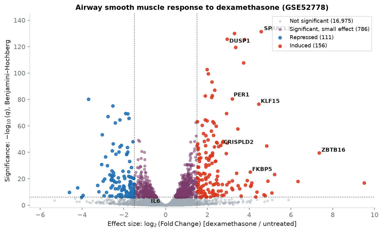
Collector: Blanca Himes et al., Harvard Medical School / Brigham and Women’s Hospital.
Design: Primary human airway smooth muscle cells from four donors; each culture split; one half treated with \(1\,\mu\text{M}\) dexamethasone for 18 h, other untreated; eight libraries sequenced.
Objective: Which of 18,028 transcripts respond to glucocorticoid treatment.
Method:DESeq2 negative-binomial model handles count overdispersion at \(n=4\) and shrinks noisy estimates; output is log fold change and FDR-adjusted \(q\) per gene.
IL6 — \(-0.75\) (41% fall), \(q = 0.071\); outside both gates because unstimulated smooth muscle barely expresses it.
8 MA plot complement
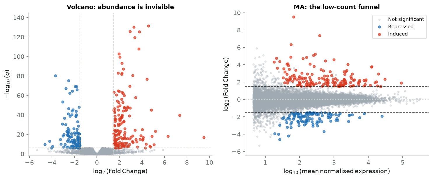
The volcano plot does not encode baseline abundance. In RNA-seq and proteomics, variance depends strongly on count level — a gene at 2 vs 6 reads can show a three-fold change from Poisson noise alone.
The MA plot plots \(\log_2\) fold change against mean expression and exposes the low-count dispersion funnel.
Code
fig, (ax_v, ax_m) = plt.subplots(1, 2, figsize=(10, 4.2))log10_base = np.log10(np.clip(df["base_mean"], 0.1, None))for name, (mask, colour, size, alpha) in groups.items():if name =="Significant, small effect":continue ax_v.scatter(lfc[mask], sig[mask], c=colour, s=size *0.7, alpha=alpha *0.8, rasterized=True) ax_m.scatter(log10_base[mask], lfc[mask], c=colour, s=size *0.7, alpha=alpha *0.8, rasterized=True, label=name)for x in (-LFC_CUT, LFC_CUT): ax_v.axvline(x, color=RULE, ls="--", lw=1)ax_v.axhline(PADJ_CUT, color=RULE, ls="--", lw=1)ax_v.set_xlabel("$\\log_2(\\mathrm{Fold\\,Change})$")ax_v.set_ylabel("$-\\log_{10}(q)$")ax_v.set_title("Volcano: abundance is invisible", fontsize=10)ax_v.set_ylim(-2, 145)ax_m.axhline(0, color=RULE, ls=":", lw=1)for y in (-LFC_CUT, LFC_CUT): ax_m.axhline(y, color=INK, ls="--", lw=1, alpha=0.7)ax_m.set_xlabel("$\\log_{10}(\\mathrm{mean\\,normalised\\,expression})$")ax_m.set_ylabel("$\\log_2(\\mathrm{Fold\\,Change})$")ax_m.set_title("MA: the low-count funnel", fontsize=10)ax_m.set_ylim(-6.5, 10.0)ax_m.legend(loc="upper right", fontsize=8, frameon=True, facecolor="white", edgecolor=RULE)plt.tight_layout()plt.show()
Figure 3: The same genes, plotted against baseline abundance: the dispersion funnel the volcano cannot show.
Below ~10 reads, fold changes fan out with no biological support. Modern pipelines apply empirical Bayes shrinkage (apeglm, ashr in DESeq2; moderated \(t\) in limma) before plotting horizontal coordinates.
9 Non-genomics applications
Requirements: many simultaneous tests, multiplicative effect size, heterogeneous variances.
Clinical proteomics — \(\log_2\) protein ratio vs significance separates biomarkers from instrument artifacts (LC-MS/MS, heavy missingness).
CRISPR screens — MAGeCK scores guide depletion; dual gates separate dependencies from non-targeting controls.
Product experimentation — top corners = real wins/regressions; top centre = statistically real but negligible drift; wings = noisy segments.
10 Plot selection
Rule
Horizontal
Vertical
Strength
Failure mode
Fold-change ranking
\(\log_2(\text{FC})\)
—
Finds large moves
Low-count noise
\(p\)-value ranking
—
\(-\log_{10}(p)\)
Finds certain moves
Negligible effects
Volcano plot
\(\log_2(\text{FC})\)
\(-\log_{10}(q)\)
Both at once
Hides abundance
MA plot
\(\log_{10}(\text{mean})\)
\(\log_2(\text{FC})\)
Exposes count variance
No significance test
Production checklist:
Use FDR-adjusted \(q\), not raw \(p\), on the vertical axis.
Check corner hits against an MA plot before committing.
With small \(n\), shrink fold changes before plotting.