Five Photos of One Kite, Five Different Shapes

What happens when you point Kendall shape analysis at a photograph instead of a specimen

Statistics
Geometry
Computer Vision
Author

Ravi Kalia

Published

August 18, 2026

Five Photos of One Kite, Five Different Shapes

I photographed the same kite five times in nine seconds. It is a rigid object made of ripstop nylon over two spars, and nothing happened to it between the first frame and the last. Line up the five outlines and they should sit on top of one another exactly.

They do not. The angle at the kite’s nose reads 81 degrees in one frame and 113 degrees in another. Run the standard shape-analysis pipeline over them and it reports the five photographs as five different shapes, with distances of up to 0.33 between them in the space it measures shape in.

That is not noise, and it is not a bug in the pipeline. It is the pipeline being asked to remove something it was never built to remove. Kendall shape analysis subtracts position, size and angle — and a camera does not add position, size and angle. It adds perspective. The repair belongs upstream of Procrustes, not inside it.

Five frames of one kite, nine seconds apart

The data is five photographs I took at the kite festival at Villa de Leyva, in Boyacá, Colombia, on 15 August 2026. They are iPhone HEIC frames, 3024 wide by 4032 tall, timestamped 13:26:12 through 13:26:21 — so the whole sample spans nine seconds. I have committed them here at half resolution, 1512 × 2016, and every coordinate in this post lives in that pixel grid.

There was no protocol. I stood in a field and pointed a phone at the sky, handheld, with no tripod, no scale bar, no fixed distance and no attempt to keep the camera still between frames. That is the point of using them. This is what field photography actually looks like, and the question I want to ask of these five frames is the one nobody asks out loud: does one rigid object photographed five times give one shape?

If the answer is no, then any study that photographs two specimens and reports a shape difference between them has a problem, because some of that difference is the photographer. In morphometrics this is the calibration step that decides whether a published finding is about the organism or about where somebody was standing. Getting it wrong means reporting a camera artefact as biology.

Kendall shape analysis is the right tool to point at this, because it is the tool that claims to delete exactly the nuisances a camera introduces. Testing it where the true answer is known in advance — five photographs of one unchanging object, so the correct shape difference is zero — is the only way to find out which nuisances it really deletes and which it silently leaves behind.

If you want the method itself rather than its failure modes, I wrote it up on synthetic pencils and a real dataset of monkey optic nerve heads in an earlier post. This one is the field test.

A photograph is a matrix, and this one is mostly cloud

Before any geometry, the photograph has to become numbers. An image is a grid of pixels, and each pixel is a triple of intensities — how much red, green and blue it carries — so a colour photograph is a stack of three matrices. Everything downstream is arithmetic on that stack.

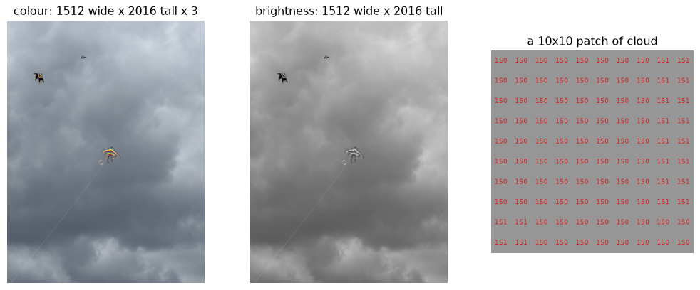
It helps to actually look at the numbers once. Here is a frame, the same frame as a single brightness matrix, and a ten-by-ten patch of sky with its raw values printed on it.

Code
import numpy as np
import matplotlib.pyplot as plt
from PIL import Image

photo = Image.open("photos/kite-01.jpg").convert("RGB")
rgb = np.asarray(photo)
grey = np.asarray(photo.convert("L"))

fig, axes = plt.subplots(1, 3, figsize=(13, 5))
axes[0].imshow(rgb)
axes[0].set_title(f"colour: {rgb.shape[1]} wide x {rgb.shape[0]} tall x {rgb.shape[2]}")
axes[1].imshow(grey, cmap="gray")
axes[1].set_title(f"brightness: {grey.shape[1]} wide x {grey.shape[0]} tall")

patch = grey[600:610, 500:510]
axes[2].imshow(patch, cmap="gray", interpolation="nearest", vmin=0, vmax=255)
for i in range(10):
    for j in range(10):
        axes[2].text(j, i, patch[i, j], ha="center", va="center", color="tab:red", fontsize=7)
axes[2].set_title("a 10x10 patch of cloud")
for ax in axes:
    ax.axis("off")
plt.show()
Figure 1: One frame as a picture, as a brightness matrix, and as raw numbers. The sky patch is flat and bright: cloud is high in brightness and almost zero in colour.

The patch is the useful part. Those numbers are all close together and all fairly large: overcast sky is bright and grey. Grey means the three channels are nearly equal, and that is what separates the sky from what is flying in it. The kite is dyed in saturated dye and the cloud is not, so the quantity that tells them apart is not brightness but saturation — how far a pixel’s colour is from grey, computed as the spread between its largest and smallest channel divided by the largest.

Saturation separates a rainbow kite from a grey sky

Saturation turns out to do the whole job on its own. Every pixel of cloud is near zero, every pixel of kite fabric is near one, and there is nothing in between to argue about. One threshold and a connected-components pass isolates the kite in all five frames.

Code
from scipy import ndimage

def saturation(image):
    """Distance from grey, per pixel: (max channel - min channel) / max channel."""
    a = np.asarray(image).astype(np.float32) / 255.0
    top, bottom = a.max(axis=2), a.min(axis=2)
    return (top - bottom) / np.maximum(top, 1e-6)

def largest_blob(mask):
    """The biggest connected component, plus its bounding box."""
    labels, count = ndimage.label(mask)
    sizes = ndimage.sum(mask, labels, range(1, count + 1))
    best = int(np.argmax(sizes)) + 1
    return labels == best, ndimage.find_objects(labels)[best - 1]

fig, axes = plt.subplots(2, 5, figsize=(16, 7))
for frame in range(1, 6):
    image = Image.open(f"photos/kite-{frame:02d}.jpg").convert("RGB")
    kite, box = largest_blob(saturation(image) > 0.30)
    pad = 30
    rows = slice(max(0, box[0].start - pad), box[0].stop + pad)
    cols = slice(max(0, box[1].start - pad), box[1].stop + pad)
    axes[0][frame - 1].imshow(np.asarray(image)[rows, cols])
    axes[0][frame - 1].set_title(f"frame {frame}")
    axes[1][frame - 1].imshow(kite[rows, cols], cmap="gray")
for ax in axes.ravel():
    ax.axis("off")
plt.show()
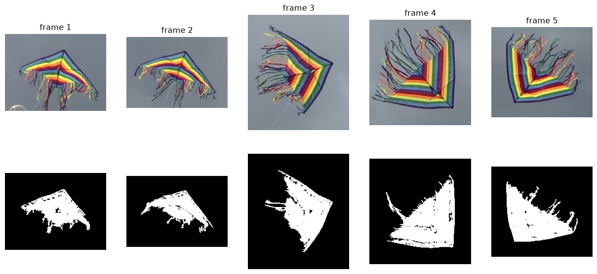
Figure 2: Top: the kite as photographed, cropped from each frame. Bottom: every pixel with saturation above 0.30. The sky vanishes completely.

Look at the top row rather than the bottom one. The same kite, nine seconds apart, appears as a wide shallow triangle in frame 1 and as a sharp narrow chevron in frame 4. Nothing about the kite changed. What changed is where it was pointing relative to the lens.

The masks also show the other problem. Roughly half of every mask is streamers — the long ribbons trailing off the back edge — and they move independently in the wind.

Correspondence is the part you cannot skip

A mask is not yet something Procrustes can use. Procrustes compares two configurations of labelled points, and the labels have to mean the same thing in both: point 3 must be the same physical spot on the kite in every photograph. That correspondence is what makes two specimens comparable at all, and it is the part that no amount of clever alignment can supply after the fact. Points chosen this way are called landmarks.

Sample points off the outline instead and you get configurations of the right size and no correspondence whatsoever — point 3 lands somewhere different on every kite, and Procrustes faithfully rotates one meaningless list onto another. That is the first way this analysis goes wrong, and it is worth ruling out before blaming anything subtler.

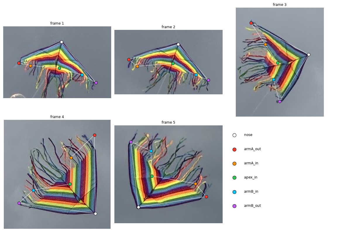
So the streamers are out. They flap, so a point on one means a different thing in each frame. The landmarks go on the sail — the rigid block of nested colour chevrons — and there is a nice accident there: the sail’s bands are ordered by colour, and colour identity is the anatomical label. Six points, all corners of the band stack:

  • nose, the outer apex where the two dark navy leading edges meet;
  • armA_out and armB_out, the far ends of those two leading edges;
  • armA_in and armB_in, the far ends of the band stack’s inner boundary on each arm;
  • apex_in, the inner apex where those two inner boundaries meet.

One of these labels is not determined by the photograph, and it is worth being blunt about it. The sail is bilaterally symmetric and so are its colour bands, so nothing in a single image says which physical wing is armA and which is armB. I fixed the choice by making every frame’s traversal run the same way round the sail, which meant swapping the two labels in frame 5 relative to how that photograph reads. That is a free choice about labelling, not a measurement — but it is a free choice that would set the headline number if the analysis were sensitive to it, so the Procrustes alignment below is built not to care, by allowing reflections. Forbid reflection and these same landmarks report a Procrustes sum of squares of 0.855 instead of 0.111; allow it, and the two labellings differ by under 6%. The model ladder further down fits each frame separately rather than to a common mean, so it is not insensitive in the same clean way — relabelling permutes points rather than exactly mirroring them, so even a six-parameter affine fit shifts a little under it.

I placed these by hand off the committed photographs, the way a morphometrician places them in tpsDig, and checked them against the overlay below. Placement is good to about ±5 pixels on a sail 160 pixels across. Hold on to that number — it decides what this analysis can and cannot conclude, and it comes back at the end.

The six sail landmarks in each frame. Nothing sits on a streamer.
Code
import csv

ORDER = ["nose", "armA_out", "armA_in", "apex_in", "armB_in", "armB_out"]

rows = list(csv.DictReader(open("landmarks.csv")))
by_frame = {}
for row in rows:
    by_frame.setdefault(int(row["frame"]), {})[row["landmark"]] = (
        float(row["x"]), float(row["y"]))

X = np.stack([np.array([by_frame[f][name] for name in ORDER]) for f in sorted(by_frame)])
print(f"{X.shape[0]} configurations of {X.shape[1]} landmarks in {X.shape[2]}D")
print(f"mean centroid size: {np.mean([np.linalg.norm(c - c.mean(0)) for c in X]):.0f} px")
5 configurations of 6 landmarks in 2D
mean centroid size: 160 px

The nose angle changes by thirty degrees, so these are not similar figures

There is a way to settle the central question before fitting anything at all, and it takes one measurement.

Kendall shape analysis quotients out the similarity group: translations, rotations, and uniform rescalings. Every one of those preserves angles. A triangle that has been moved, turned and enlarged has exactly the angles it started with. So if the five frames really were related by similarity — if the camera only ever moved, turned and zoomed — the angle at the kite’s nose would be the same number five times.

Code
def nose_angle(config):
    """Angle at the nose, between the two leading edges, in degrees."""
    left = config[ORDER.index("armA_out")] - config[ORDER.index("nose")]
    right = config[ORDER.index("armB_out")] - config[ORDER.index("nose")]
    cosine = np.dot(left, right) / (np.linalg.norm(left) * np.linalg.norm(right))
    return np.degrees(np.arccos(cosine))

angles = np.array([nose_angle(c) for c in X])
for frame, angle in enumerate(angles, start=1):
    print(f"  frame {frame}: {angle:6.2f} degrees")
print(f"\nspread: {angles.max() - angles.min():.1f} degrees")
  frame 1: 104.01 degrees
  frame 2: 112.93 degrees
  frame 3:  86.97 degrees
  frame 4:  81.29 degrees
  frame 5:  88.01 degrees

spread: 31.6 degrees

Thirty-one degrees of spread on a quantity that similarity cannot touch. Jittering the landmarks by 5 pixels and remeasuring puts the standard deviation of this angle between 3.6 and 6.3 degrees depending on the frame — so my digitising is worth a few degrees, nowhere near enough to manufacture thirty. Whatever maps one frame onto another, it is not a similarity, and that is settled without running Procrustes once.

The interesting question is no longer whether the pipeline will struggle. It is what the struggle looks like, and what the right group turns out to be.

Procrustes cannot remove what it was not built to remove

The standard pipeline is three deletions, and none of them involve fitting anything. Translation comes off by moving each configuration so its landmarks average to the origin. Size comes off by dividing by the spread of the landmarks around that centre — the Frobenius norm — so every configuration ends up at size one. Rotation comes off by turning each configuration until it sits as close as least squares allows to a target, which falls out of a singular value decomposition.

Rotation needs something to rotate onto, and there is no target to start from. The way out is to guess and refine: take one configuration as a provisional mean, rotate everything onto it, average, and repeat until the mean stops moving. That loop is generalised Procrustes analysis.

Code
def centre_and_scale(config):
    """Remove translation and size."""
    centred = config - config.mean(axis=0)
    return centred / np.linalg.norm(centred)

def align_onto(config, target):
    """Least-squares orthogonal map of `config` onto `target`, via an SVD.

    Reflections are allowed, deliberately. The usual version of this function
    forbids them, on the grounds that a mirror image is a different shape. That
    is right for a left and a right hand; it is wrong here, because which wing
    of a symmetric sail got labelled `armA` is a free choice rather than a fact
    about the kite (see above). Forbidding reflection would charge that free
    choice to the kite's shape.
    """
    u, _, vt = np.linalg.svd(target.T @ config)
    return config @ (vt.T @ u.T)

def gpa(configs, prepare=centre_and_scale, tol=1e-13, max_iter=500):
    """Generalised Procrustes: prepare each configuration, then iterate to a mean."""
    aligned = np.stack([prepare(c) for c in configs])
    mean = aligned[0]
    for _ in range(max_iter):
        aligned = np.stack([centre_and_scale(align_onto(c, mean)) for c in aligned])
        new_mean = centre_and_scale(aligned.mean(axis=0))
        if np.linalg.norm(new_mean - mean) < tol:
            break
        mean = new_mean
    return aligned, mean

aligned, mean_shape = gpa(X)
residual = np.linalg.norm(aligned - mean_shape, axis=(1, 2))
similarity_ss = float((residual ** 2).sum())
print("residual to the mean shape:", residual.round(4))
print(f"Procrustes sum of squares: {similarity_ss:.5f}")
print(f"RMS residual: {residual.mean():.4f}  ({100 * residual.mean():.1f}% of centroid size)")
residual to the mean shape: [0.1381 0.1764 0.1416 0.1643 0.1173]
Procrustes sum of squares: 0.11100
RMS residual: 0.1475  (14.8% of centroid size)

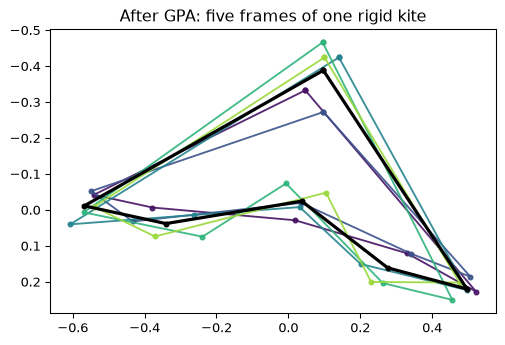
Every configuration has size one, so a residual of 0.15 means each frame sits about 15% of its own extent away from the average frame. For five photographs of one rigid object taken over nine seconds, that is enormous. Plotted, the five aligned sails do not agree on anything except roughly where the nose is.

Code
COLOURS = plt.cm.viridis(np.linspace(0.05, 0.85, 5))

def draw(ax, config, colour, lw=1.4, alpha=0.9):
    loop = np.vstack([config, config[0]])
    ax.plot(loop[:, 0], loop[:, 1], "-o", color=colour, lw=lw, ms=3.5, alpha=alpha)

fig, ax = plt.subplots(figsize=(6, 5))
for config, colour in zip(aligned, COLOURS):
    draw(ax, config, colour)
draw(ax, mean_shape, "black", lw=2.4, alpha=1.0)
ax.set_aspect("equal")
ax.invert_yaxis()
ax.set_title("After GPA: five frames of one rigid kite")
plt.show()
Figure 3: The five sails after generalised Procrustes analysis, with the mean shape in black. This is the best that translation, scale and rotation can do.

This is the failure, reproduced honestly, and note when it happens: after the landmarks were placed properly, with real correspondence, on the rigid part of the kite only. Fixing the correspondence was necessary. It was not sufficient.

Fit similarity, affine and projective, and read off which one the camera used

If similarity is too small a group, the obvious move is to ask how much bigger the right one is. There is a natural ladder of candidates, each containing the last.

Similarity has four degrees of freedom — translate, rotate, scale — and preserves angles. Affine has six: it adds shear and lets the two axes scale differently, so it no longer preserves angles but still maps parallel lines to parallel lines. This is the model you get from a flat object photographed from far enough away that the near edge and the far edge are effectively the same distance from the lens, which is called weak perspective. Projective has eight, adds genuine perspective, and is what a plane photographed from any viewpoint actually undergoes: parallel lines converge, and only straight lines are guaranteed to stay straight.

Fit each of the three to each frame and see which one explains the photographs.

Code
from scipy.optimize import least_squares

def fit_similarity(src, dst, allow_reflection=True):
    """Best similarity map from `src` onto `dst` (Umeyama).

    Reflection is allowed by default, matching the Procrustes alignment above
    and for the same reason: the wing labelling is a free choice. Refusing it
    takes more than flipping the rotation matrix -- the smallest singular
    value's contribution to the optimal scale flips sign with it. Leaving
    `trace` at ``sv.sum()`` in that branch overshoots the scale, and is an easy
    bug to write by accident.
    """
    mu_s, mu_d = src.mean(0), dst.mean(0)
    s0, d0 = src - mu_s, dst - mu_d
    u, sv, vt = np.linalg.svd(d0.T @ s0)
    rotation = u @ vt
    trace = sv.sum()
    if not allow_reflection and np.linalg.det(rotation) < 0:
        u = u.copy()
        u[:, -1] *= -1
        rotation = u @ vt
        trace = sv[0] - sv[1]
    return (s0 @ rotation.T) * (trace / (s0 ** 2).sum()) + mu_d

def fit_affine(src, dst):
    design = np.hstack([src, np.ones((len(src), 1))])
    return design @ np.linalg.lstsq(design, dst, rcond=None)[0]

def apply_homography(h, src):
    p = np.hstack([src, np.ones((len(src), 1))]) @ h.T
    return p[:, :2] / p[:, 2:3]

def fit_projective(src, dst):
    """Normalised DLT for a starting point, then refine on *geometric* error.

    The plain DLT minimises an algebraic residual, which on six points can be
    far from the least-squares answer -- badly enough to score worse than the
    affine fit nested inside it, which is impossible for a correct fit.
    """
    def normalise(p):
        mu = p.mean(0)
        q = p - mu
        s = np.sqrt(2) / np.sqrt((q ** 2).sum(1)).mean()
        return np.array([[s, 0, -s * mu[0]], [0, s, -s * mu[1]], [0, 0, 1]]), np.hstack(
            [q * s, np.ones((len(p), 1))])

    t_src, ns = normalise(src)
    t_dst, nd = normalise(dst)
    rows = []
    for (x, y, _), (u, v, _) in zip(ns, nd):
        rows.append([x, y, 1, 0, 0, 0, -u * x, -u * y, -u])
        rows.append([0, 0, 0, x, y, 1, -v * x, -v * y, -v])
    _, _, vt = np.linalg.svd(np.array(rows))
    guess = np.linalg.inv(t_dst) @ vt[-1].reshape(3, 3) @ t_src
    guess = guess / guess[2, 2]
    fit = least_squares(
        lambda p: (apply_homography(np.append(p, 1.0).reshape(3, 3), src) - dst).ravel(),
        guess.ravel()[:8], method="lm", max_nfev=20000)
    return apply_homography(np.append(fit.x, 1.0).reshape(3, 3), src)

def rms(predicted, target):
    return float(np.sqrt(((predicted - target) ** 2).sum(1).mean()))

MODELS = [("similarity", 4, fit_similarity), ("affine", 6, fit_affine),
          ("projective", 8, fit_projective)]

print(f"{'onto frame 1':>14}" + "".join(f"{n + f' ({d})':>15}" for n, d, _ in MODELS))
totals = {name: [] for name, _, _ in MODELS}
for j in range(1, 5):
    line = f"{'frame ' + str(j + 1):>14}"
    for name, _, fit in MODELS:
        value = rms(fit(X[j], X[0]), X[0])
        totals[name].append(value)
        line += f"{value:15.2f}"
    print(line)
print(f"\n{'mean':>14}" + "".join(f"{np.mean(v):15.2f}" for v in totals.values()) + "   px")
  onto frame 1 similarity (4)     affine (6) projective (8)
       frame 2           7.14           4.79           2.76
       frame 3          14.20           9.73           8.03
       frame 4          15.78          10.56           8.78
       frame 5          12.96           7.84           7.20

          mean          12.52           8.23           6.69   px

The ladder comes out monotone, which is what should happen: each model contains the one before it, so a fit that truly attains its group’s optimum cannot do worse than the group inside it. Worth saying that this is a property of the answers rather than a guarantee from the code — fit_projective is a local refinement from a DLT seed with no global optimality promise, which is exactly why its unrefined version scored worse than affine.

These numbers mean nothing on their own, because every extra parameter buys some fit even against pure noise. Each model needs its own floor, and the floor is not “±5 pixels” — it is whatever that model scores between two independently jittered copies of one frame, where the true difference is zero by construction.

Code
rng = np.random.default_rng(1)

print(f"{'':12}{'observed':>10}{'noise floor':>13}{'ratio':>8}")
for name, _, fit in MODELS:
    scores = []
    for base in X:
        for _ in range(120):
            a = base + rng.normal(0, 5, base.shape)
            b = base + rng.normal(0, 5, base.shape)
            scores.append(rms(fit(a, b), b))
    floor, seen = float(np.mean(scores)), float(np.mean(totals[name]))
    print(f"{name:12}{seen:10.2f}{floor:13.2f}{seen / floor:7.1f}x")
              observed  noise floor   ratio
similarity       12.52         7.93    1.6x
affine            8.23         6.68    1.2x
projective        6.69         5.75    1.2x

That reframes the ladder. Similarity leaves 12.5 pixels against a floor of 7.9 — clearly above its own noise, and the quantitative version of what the nose angle already said. Affine drops to 8.2 against a floor of 6.7, barely above it, and projective to 6.7 against 5.8, the same ratio again.

So affine does not merely beat similarity: it brings the residual down to roughly what my own digitising manufactures, which is as far as this data can take it. There is nothing measurable left for the projective term to explain, and its extra 1.5 pixels are bought with two more parameters on six landmarks. The reading is that the camera was far enough away for weak perspective to hold, and affine is the smallest model that does the job — a claim about these photographs, not about cameras. With more landmarks, or a kite closer to the lens, the projective step would separate.

Quotient out the affine group and most of the shape difference disappears

If affine is the nuisance group, the fix is to quotient by it rather than by similarity — to compare configurations only up to affine maps, so the parts of the difference an affine map could have produced stop counting.

There is a trap here, and it cost me a wrong answer before I noticed. The obvious approach is to reuse the Procrustes loop with the rotation step swapped for a least-squares affine fit. It runs, it converges, and it reports a beautifully small residual — because the affine group can squash a configuration flat onto a line and leave it at size one while doing so. My first run drove all five sails to an aspect ratio of 0.0002 and announced that 74% of the shape variation was viewpoint. It was measuring the collapse.

Iterating affine fits to a mean is not affine Procrustes

Normalising to unit centroid size stops the configurations shrinking to a point. It does not stop them flattening to a line, which has unit size too. If you swap the rotation step of a GPA loop for an affine fit, check the aspect ratio of what comes out before believing the residual.

The way that works is to remove the affine part in closed form instead of searching for it. Centre a configuration and rescale its two principal axes to be equal, so its second moment becomes isotropic. Any affine image of a configuration lands on the same canonical form, so what survives is exactly the non-affine part of its shape — and nothing can collapse, because the answer is isotropic by construction.

Code
def remove_affine(config):
    """Map a configuration to its affine-invariant canonical form."""
    centred = config - config.mean(axis=0)
    u, _, _ = np.linalg.svd(centred, full_matrices=False)
    whitened = u * np.sqrt(len(config))     # singular values replaced by 1
    return whitened / np.linalg.norm(whitened)

affine_aligned, affine_mean = gpa(X, prepare=remove_affine)
affine_residual = np.linalg.norm(affine_aligned - affine_mean, axis=(1, 2))
affine_ss = float((affine_residual ** 2).sum())

aspect = [np.divide(*np.linalg.svd(c, compute_uv=False)[::-1]) for c in affine_aligned]
print(f"aspect ratio of the aligned configurations: {np.mean(aspect):.3f}  (1.0 = no collapse)")
print(f"\nProcrustes SS, similarity quotient: {similarity_ss:.5f}")
print(f"Procrustes SS, affine quotient    : {affine_ss:.5f}")
print(f"share of shape variation the viewpoint explains: {100 * (1 - affine_ss / similarity_ss):.1f}%")
aspect ratio of the aligned configurations: 1.000  (1.0 = no collapse)

Procrustes SS, similarity quotient: 0.11100
Procrustes SS, affine quotient    : 0.06839
share of shape variation the viewpoint explains: 38.4%

Quotienting by the affine group removes 38% of the measured shape variation. That is a real number rather than a collapse — the aligned configurations keep an aspect ratio of 1.0, as the construction guarantees.

It is also a lot less than the 74% the broken version reported, and less than the ladder above might have led you to expect. Which raises the obvious question about the 62% still sitting there.

Caveat: most of what is left is my own hand

The remaining variation has two plausible sources, and they are not equally interesting. One is the kite: a delta sail is not a rigid plane. It billows into a dihedral under wind load, so it is really two curved panels hinged at the spine, and no two-dimensional map of any kind can align a shape that is genuinely bending in three dimensions. The other is me, placing six landmarks by eye to about ±5 pixels.

These are easy to tell apart, because the second one can be simulated. Take a frame, replicate it five times so the true shape difference is exactly zero, jitter every landmark, and measure the Procrustes sum of squares that digitising error alone manufactures.

One wrinkle before the numbers. The jitter below is Gaussian with standard deviation sigma, while my ±5 pixels was meant as a rough bound — and a Gaussian at sigma = 5 puts about a third of its points beyond 5 pixels, with an RMS displacement nearer 7. So the simulated floor at sigma = 5 is if anything a little pessimistic about my hand. That cuts against the conclusion I want, which is the right direction for a check to err in.

Code
rng = np.random.default_rng(0)

def procrustes_ss(configs, prepare):
    aligned, mean = gpa(configs, prepare=prepare)
    return float((np.linalg.norm(aligned - mean, axis=(1, 2)) ** 2).sum())

# Every frame gets a turn as the base. Which one you pick matters: the flattest
# sails amplify jitter under the affine quotient, so a single base frame can
# understate the floor by a factor of three.
print(f"{'sigma':>7}{'similarity SS':>26}{'affine SS':>26}")
for sigma in [2, 3, 5, 8]:
    per_base = np.array([
        [np.mean([procrustes_ss(base + rng.normal(0, sigma, (5,) + base.shape), prepare)
                  for _ in range(300)])
         for prepare in (centre_and_scale, remove_affine)]
        for base in X
    ])
    cells = "".join(
        f"{per_base[:, k].mean():14.4f}  [{per_base[:, k].min():.4f}-{per_base[:, k].max():.4f}]"
        for k in (0, 1))
    print(f"{sigma:5.0f}px{cells}")

print(f"\n{'observed':>7}{similarity_ss:14.4f}{'':15}{affine_ss:14.4f}")
  sigma             similarity SS                 affine SS
    2px        0.0052  [0.0037-0.0063]        0.0068  [0.0031-0.0102]
    3px        0.0115  [0.0081-0.0145]        0.0151  [0.0073-0.0223]
    5px        0.0323  [0.0221-0.0409]        0.0418  [0.0197-0.0629]
    8px        0.0806  [0.0553-0.0989]        0.1075  [0.0505-0.1623]

observed        0.1110                       0.0684

This table decides how much of the post survives, and it is worth reading the brackets rather than the means. The spread across base frames is wide, because whitening a nearly flat configuration amplifies whatever jitter you put into it — frames 1 and 2 are the most foreshortened sails, and they generate roughly three times the affine floor that frame 4 does. A simulation run off a single base frame would have hidden that entirely.

The similarity result holds. Observed SS is 0.111 against a sigma = 5 floor of 0.032 on average, so about three and a half times the noise — and still 2.7 times it even against the most pessimistic base frame. The similarity quotient fails for reasons that are not my handwriting.

The affine result does not hold. After quotienting out the affine group the residual is 0.068 against a floor of 0.042, which is 1.6 times the noise on average and only 1.1 times against the worst base frame. At sigma = 8 the floor passes the observed value outright. There is no residual here I can claim, and in particular I cannot claim the sail’s billow, which is the answer I went looking for. Measuring that would need more landmarks, placed more precisely, on a kite filling more of the frame.

So the defensible summary is narrower than the one I set out to write. Similarity is decisively the wrong group to quotient by, and moving to the affine group removes a large and real chunk of the disagreement between these photographs. Whether anything at all is left after that — the kite’s own bending, or any other departure from a flat plane under an affine camera — is below what six hand-placed landmarks can resolve, and this analysis should not be read as evidence either way.

The same pipeline in R’s shapes package

Everything above is hand-rolled, which makes it worth checking against an implementation nobody wrote for this post. Ian Dryden’s shapes package is the reference implementation of this material in R — it ships procGPA for generalised Procrustes, riemdist for Riemannian distance in shape space, tpsgrid for thin-plate spline deformation grids, and shapepca for principal components of shape. What it does not do is touch the photographs: tpsgrid draws a deformation, it does not apply one to pixels. That comes in the next section, and needs a little more machinery.

The R script reads the same landmarks.csv and runs the same two analyses. It is not executed by the render — it runs ahead of time and commits its figures, so this post builds on a machine with no R at all — and it lives at src/shapes_analysis.R.

#| eval: false
options(rgl.useNULL = TRUE)
library(shapes)

# landmarks.csv -> the k x m x n array every shapes:: function expects
X <- array(NA_real_, c(6, 2, 5))   # 6 landmarks, 2 coordinates, 5 frames

# Quotient out similarity. reflect = TRUE because the sail is bilaterally
# symmetric: no single photograph says which physical wing is which, so the
# labelling is a free choice and should not count as shape difference.
sim <- procGPA(X, scale = TRUE, reflect = TRUE)

# Quotient out affine, in closed form -- see the callout above for why the
# iterative version collapses.
whiten <- function(cfg) {
  cfg <- scale(cfg, center = TRUE, scale = FALSE)
  w <- svd(cfg)$u * sqrt(nrow(cfg))
  w / sqrt(sum(w^2))
}
aff <- procGPA(array(apply(X, 3, whiten), dim(X)), scale = TRUE, reflect = TRUE)

# Pairwise Riemannian distance in Kendall shape space
riemdist(X[, , 1], X[, , 2])

# Deformation grids, mean shape -> each frame
tpsgrid(sim$mshape, sim$rotated[, , 3], mag = 1, ngrid = 16, opt = 1)
Code
import json

r = json.load(open("r_results.json"))
print(f"R {r['r_version']}, shapes {r['shapes_version']}\n")
print(f"{'':22}{'R':>12}{'Python':>12}")
print(f"{'similarity SS':22}{r['similarity']['procrustes_ss']:12.5f}{similarity_ss:12.5f}")
print(f"{'affine SS':22}{r['affine']['procrustes_ss']:12.5f}{affine_ss:12.5f}")
print(f"{'uniform share':22}{100 * r['uniform_share']:11.1f}%{100 * (1 - affine_ss / similarity_ss):11.1f}%")

riem = np.array(r["riemannian"])
print("\npairwise Riemannian distance in shape space (R's riemdist):")
print(np.round(riem, 3))
print(f"\nlargest: {riem.max():.3f} between frames "
      f"{np.unravel_index(riem.argmax(), riem.shape)[0] + 1} and "
      f"{np.unravel_index(riem.argmax(), riem.shape)[1] + 1}")
R 4.0.5, shapes 1.2.6

                                 R      Python
similarity SS              0.11100     0.11100
affine SS                  0.06839     0.06839
uniform share                38.4%       38.4%

pairwise Riemannian distance in shape space (R's riemdist):
[[0.    0.124 0.249 0.278 0.227]
 [0.124 0.    0.298 0.326 0.237]
 [0.249 0.298 0.    0.16  0.187]
 [0.278 0.326 0.16  0.    0.192]
 [0.227 0.237 0.187 0.192 0.   ]]

largest: 0.326 between frames 2 and 4

The two pipelines agree to five decimal places, which is the point of running both.

The Riemannian distances are worth reading on their own. They measure separation along the curved shape space rather than straight through it, and the largest is 0.33 — between two photographs of one rigid object, nine seconds apart. That single number is the whole problem in one line.

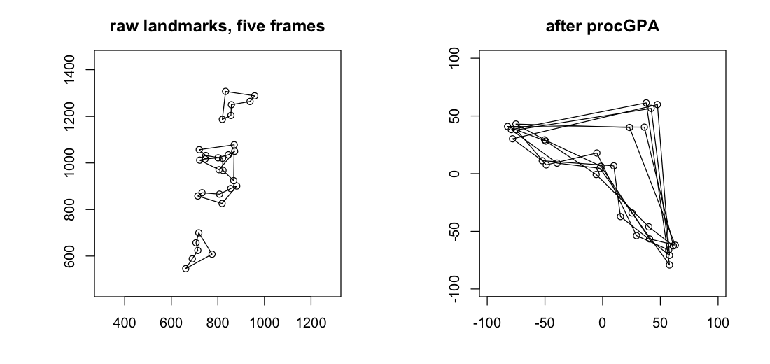
Before the grids, the plainest view shapes offers. plotshapes draws configurations on one set of axes: on the left the five frames as digitised, scattered across the photograph in raw pixel coordinates, and on the right the same five after procGPA has removed position, size and rotation.

plotshapes on the raw landmarks and after procGPA. Removing position, size and rotation brings the five configurations onto one another — and the scatter still visible on the right is the 0.111 the post has been quoting all along.

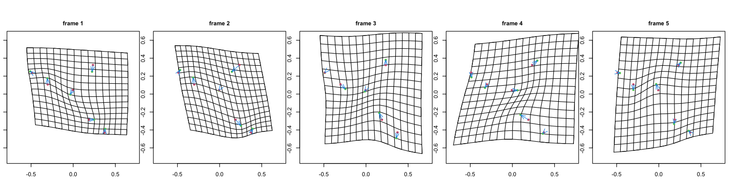
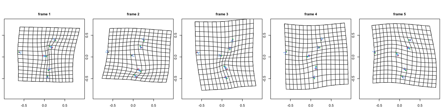
The deformation grids show the same story pictorially. tpsgrid draws the thin-plate spline that carries the mean shape onto one frame: a grid drawn on the average kite, then bent so its landmarks land on that frame’s.

Thin-plate splines carrying the mean shape onto each frame, after quotienting out similarity only. The grids have to absorb the entire viewpoint change, so they shear and bow across their whole width.

The same splines after quotienting out affine maps. The global shear is gone and what remains is local and much milder — though, per the caveat above, most of it is digitising noise rather than the kite.

This is what “the thin-plate splines were not good” looks like when you diagnose it rather than tune it. TPS was never the problem. It was faithfully drawing a deformation that was mostly camera.

Warping the photographs themselves shows the size of what was fixed

Everything so far has been six points per frame. The grids above deform an abstract mean, and a reader has to take on trust that this corresponds to anything in the sky. The thin-plate spline that bends a grid will just as happily bend an image, so the honest way to finish is to send the photographs through the same pipeline and look at them.

Each frame gets transported into one shared panel twice — once by the best similarity map, once by the best affine map — and then the animation morphs between consecutive frames, interpolating the landmarks linearly and bending both photographs onto the intermediate shape before cross-dissolving. That last part is the spline doing the work that tpsgrid only illustrates.

#| eval: false
# U(r) = r^2 log r^2, the 2D biharmonic kernel: the shape a thin metal plate
# takes when pinned at the landmarks. Solving for an affine part plus one
# radial term per landmark gives the smoothest map carrying every source
# landmark exactly onto its target.
tps_kernel <- function(d2) ifelse(d2 > 0, d2 * log(d2), 0)

tps_fit <- function(src, dst) {
  K <- tps_kernel(as.matrix(dist(src))^2)
  P <- cbind(1, src)
  L <- rbind(cbind(K, P), cbind(t(P), matrix(0, 3, 3)))
  W <- solve(L, rbind(dst, matrix(0, 3, 2)))
  list(src = src, w = W[seq_len(nrow(src)), ], a = W[nrow(src) + 1:3, ])
}

tps_apply <- function(fit, pts) {
  d2 <- outer(pts[, 1], fit$src[, 1], "-")^2 + outer(pts[, 2], fit$src[, 2], "-")^2
  cbind(1, pts) %*% fit$a + tps_kernel(d2) %*% fit$w
}

# Warping an image is the same map run backwards: for every output pixel, ask
# where in the original photograph it came from, then sample there.
warp <- function(photo, from, to) {
  sample_image(photo, tps_apply(tps_fit(to, from), output_grid))
}

The static version first, because it carries the finding on its own and an animation should never be the only copy of a result.

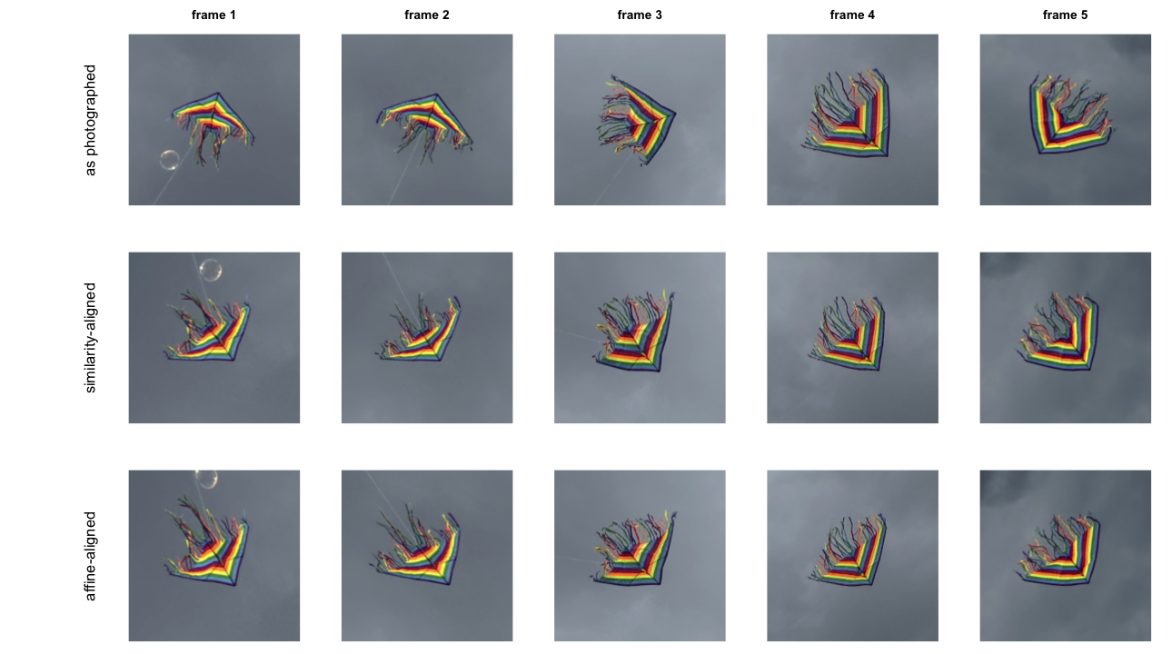
Five photographs of one kite. Top: a plain window on each photograph, the same size in source pixels every time, centred on the kite so it stays in frame — orientation and relative size untouched. Middle: transported into a shared frame by the best similarity map. Bottom: by the best affine map.

The top-to-middle step is the dramatic one, and it is worth being clear that this is not the post’s argument — it is just Procrustes doing the job it has always been able to do. Size and rotation come off, and five wildly different views become five broadly comparable ones. Position is already gone in the top row, since a window that did not follow the kite would lose it entirely.

The middle-to-bottom step is the post’s argument, and it is small. That is the correct size. A 38% reduction in Procrustes sum of squares does not look like much when you paint it onto pixels, and pretending otherwise would be the wrong lesson to take from this.

Caveat: outside six landmarks the spline is guessing

The streamers tear, smear and swirl in both warped rows, and that is not a bug to be tuned out. A thin-plate spline is pinned only where you pin it. Inside the hull of the six sail landmarks it interpolates between constraints; outside, it extrapolates from none, and the ribbons trailing off the back edge are entirely outside. They are also genuinely non-rigid, so there is no correspondence out there to get right in the first place.

Read that way the smearing is informative: it marks exactly where this analysis has something to say and where it does not.

The animation, and what it can and cannot show

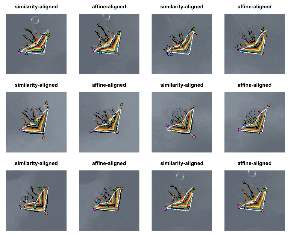
Five photographs morphing through a common frame, aligned by similarity (left) and by affine (right). The white dashed hexagon is the mean shape, fixed in both panels. Spikes run from each mean landmark to where that frame’s landmark actually lands, drawn at three times life sizetpsgrid has a mag argument for the same reason. Shorter spikes on the right are the affine map’s 28% improvement in landmark registration.

The magnification is not showmanship, and the reason is worth stating because it is a result in itself. Measured on the pixels alone, the two panels are indistinguishable. Averaged over the landmarks’ bounding box — the sail itself, rather than the empty sky around it — the standard deviation across the five aligned frames is 0.127 per pixel under similarity and 0.128 under affine. Taken over the whole panel it is 0.072 and 0.074. Whichever region you pick, the affine version comes out a hair worse. Nothing to see.

That is not because the affine map fails. It is because pixel disagreement between these photographs is dominated by things no two-dimensional alignment can touch — which colour bands a given viewpoint exposes, how the light falls, and the streamers, which are not in correspondence at all. The affine map improves landmark registration from 7.0 to 5.1 panel pixels, roughly a quarter, and on a 220-pixel panel a two-pixel improvement is invisible without help.

So the animation shows two true things at once. The kite really does settle into a common frame, which is what alignment is for. And the improvement this post spent its length establishing is real, reproducible, and far too small to see unless you draw it. Both are worth knowing before trusting an alignment because the overlay looked convincing.

Shape analysis only subtracts what you tell it to

The five photographs are of one rigid kite over nine seconds, and the pipeline reports them as five shapes up to 0.33 apart. Nothing in that is a defect of Kendall shape analysis. It removes translation, size and rotation, exactly as advertised, and it removed them here — the failure is that those three were not the whole nuisance.

That is the part worth carrying away. On a lab bench the similarity group usually is the whole nuisance: the specimen is flat, the camera is square to it, and moving the ruler is the only thing that varies. Point a lens at something in the air and the nuisance group grows, silently. Procrustes will not tell you this has happened. It will converge, return a mean shape, and hand you a number.

Three cheap habits catch it. Measure something the group you are quotienting by cannot change — an angle, for similarity — and check whether it holds still. Simulate your own measurement error before believing any residual, because the number that decided how much of this post I could defend was not the Procrustes sum of squares; it was ±5 pixels. And do not let a picture settle it either way: warping the photographs into register made a real 38% improvement look like nothing at all, and a convincing overlay would have hidden the same gap just as easily in the other direction.